Abstraction
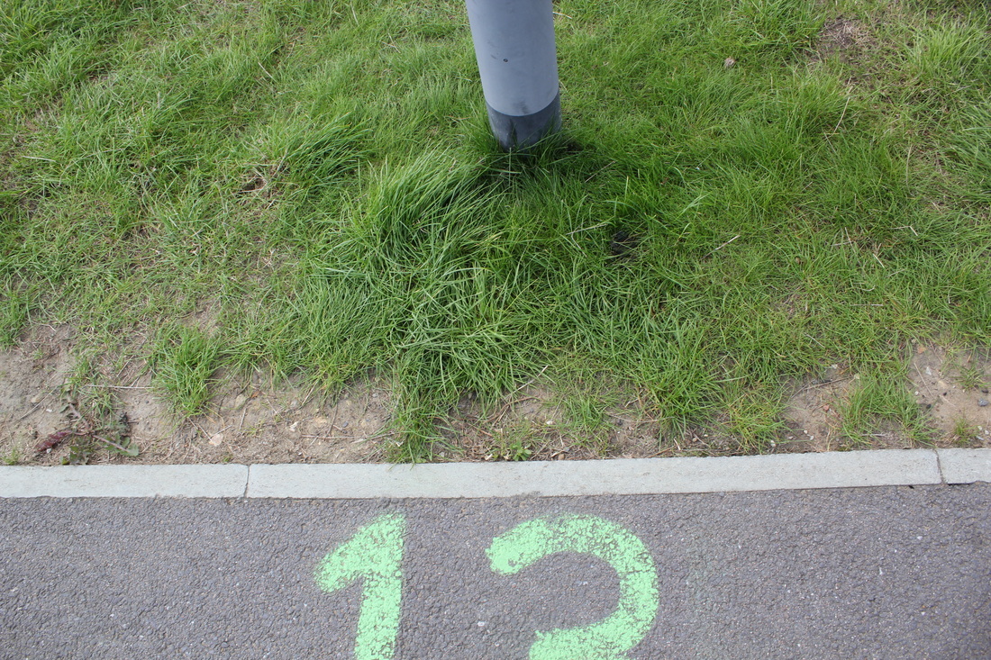
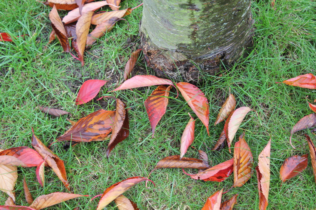
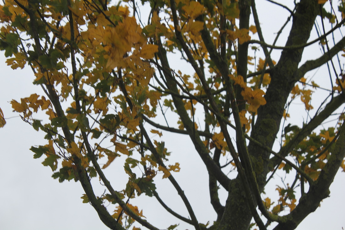
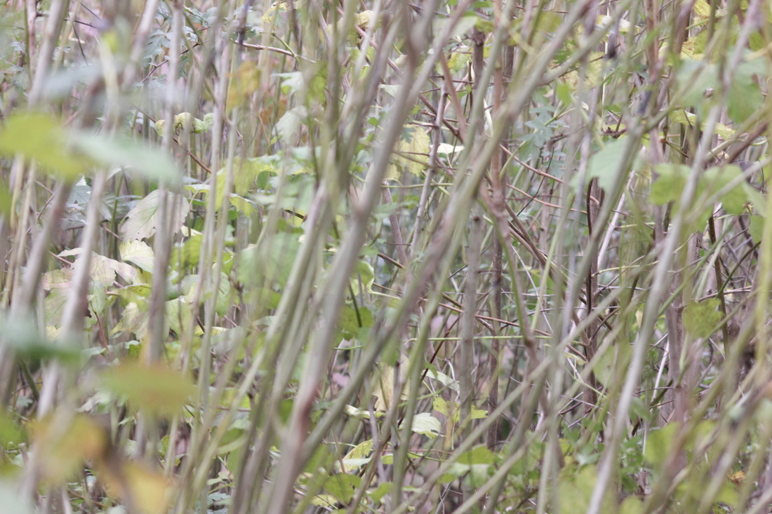
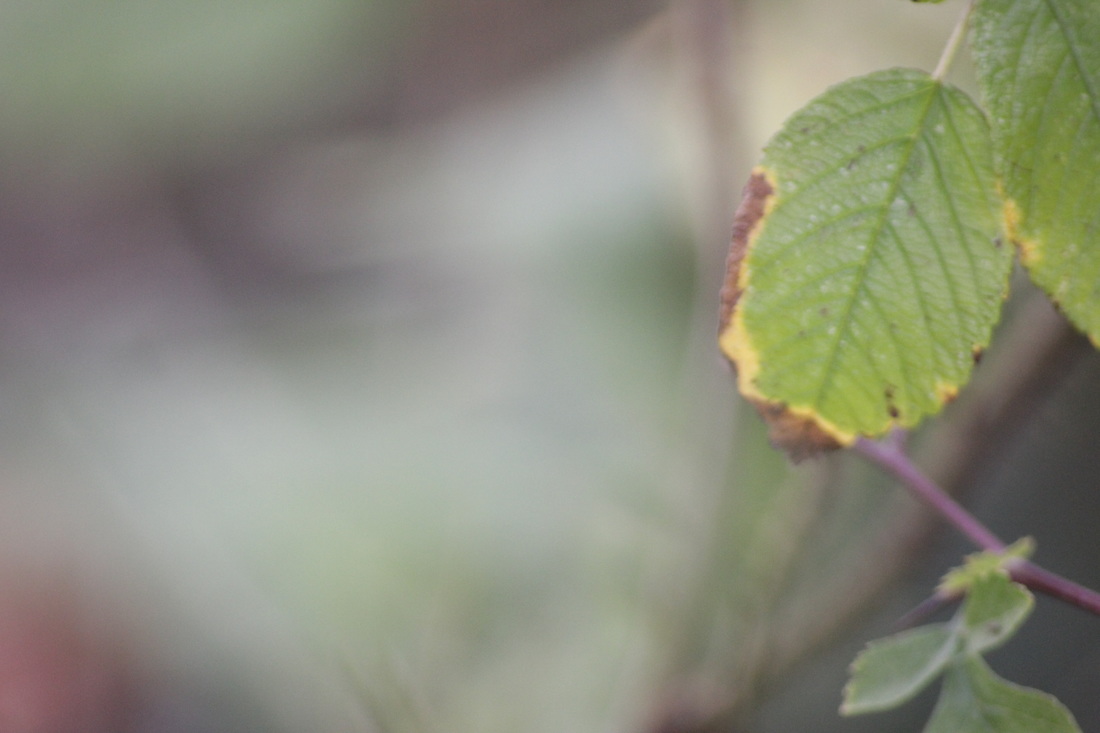
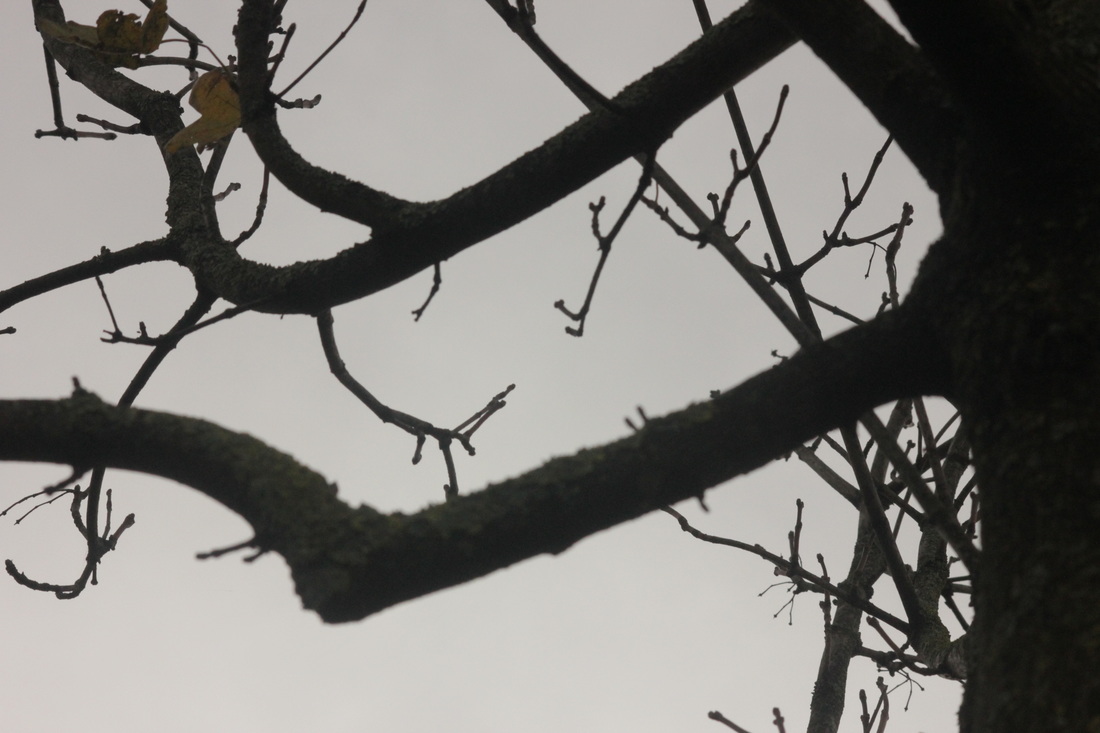
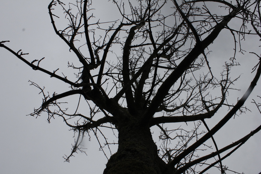
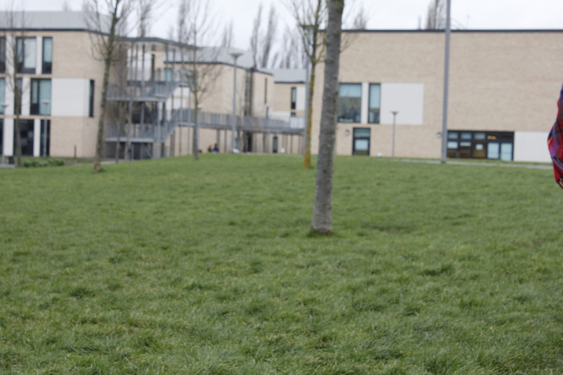
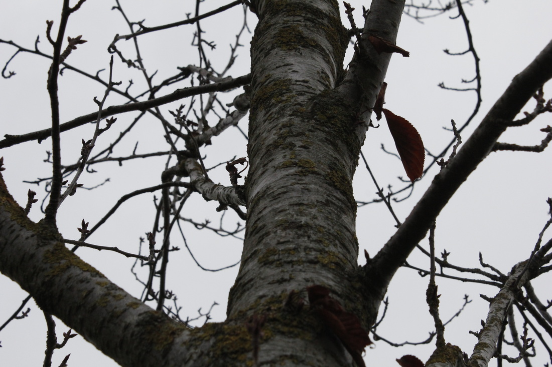
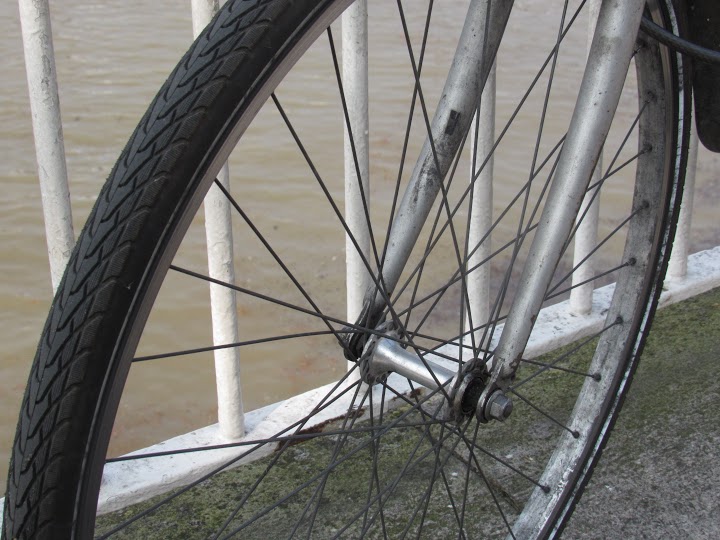
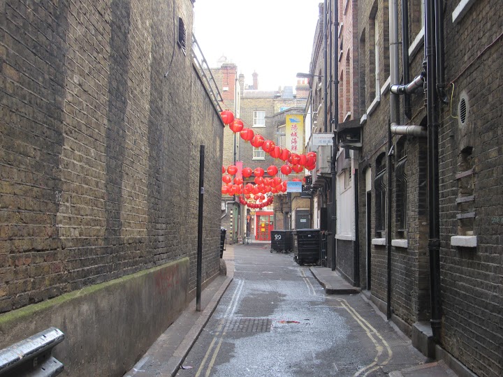
First Photo Shoot
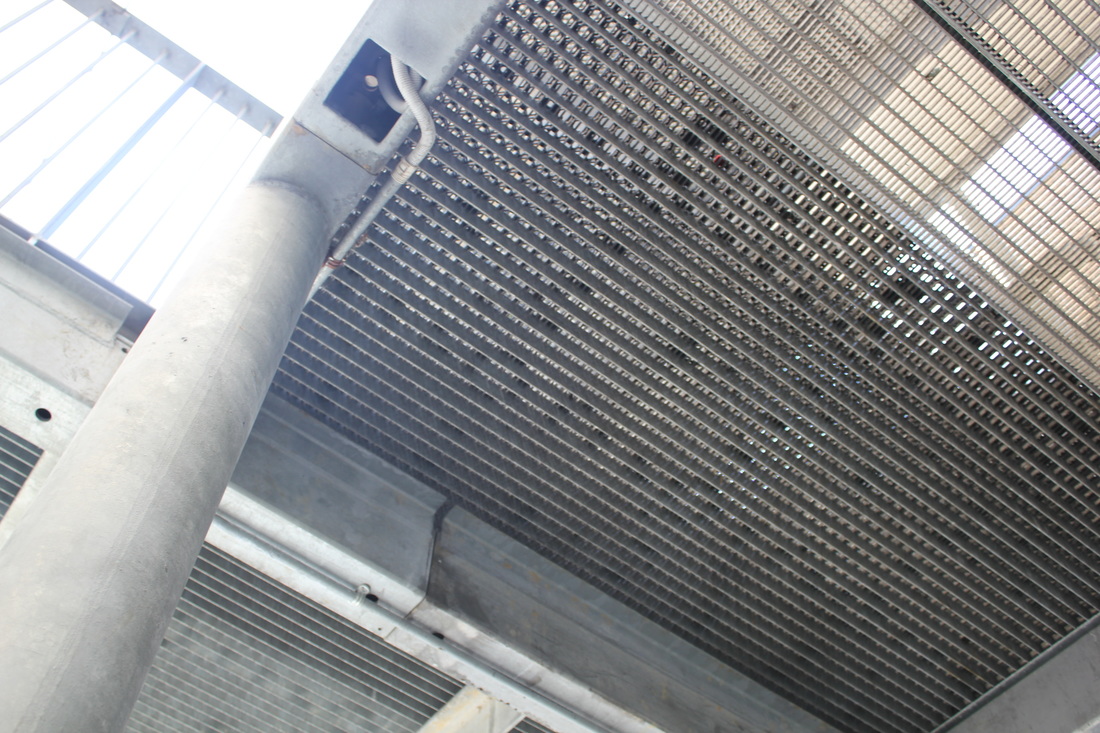
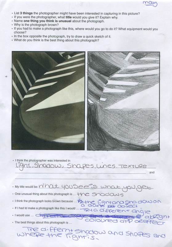
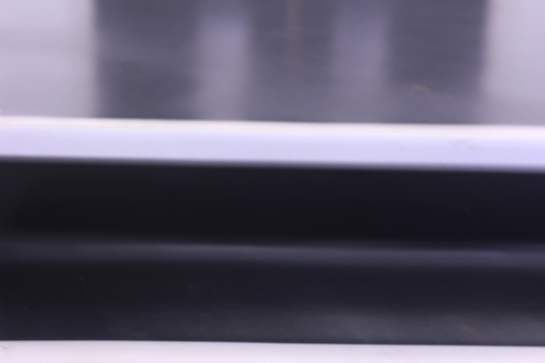
The Formal Elements
Focus:
Which areas appear clearest or sharpest in the photograph? Which do not?
Light:
Which areas of the photograph are brightest? Are there any shadows? Does the photograph allow you to guess the time of day? Is the light natural or artificial? Harsh or soft? Reflected or direct?
Line:
Are there objects in the photograph that act as lines? Are they straight, curvy, thin, thick? Do the lines create direction in the photograph? Do they outline? Do the lines show movement or energy?
Repetition:
Are there any objects, shapes or lines which repeat and create a pattern?
Shape:
Do you see geometric (straight edged) or organic (curvy) shapes? Which are they?
Space:
Is there depth to the photograph or does it seem shallow? What creates this appearance? Are there important negative (empty) spaces in addition to positive (solid) spaces? Is there depth created by spatial illusions i.e. perspective?
Texture:
If you could touch the surface of the photograph how would it feel? How do the objects in the picture look like they would feel?
Value/Tone:
Is there a range of tones from dark to light? Where is the darkest value? Where is the lightest?
|
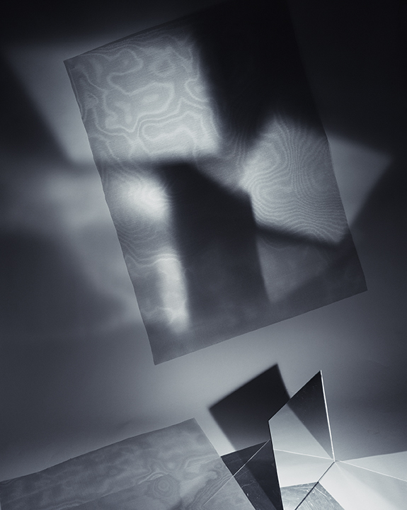
Barbara Kasten, Scene III, 2012I think this picture is really abstract because when I looked at it I couldn't tell what it was and also I could see loads of shadows and different shapes and textures. If I was to touch the texture of the big square on the picture I would think it would be bumpy. Also I can see a mirror at the bottom of the picture. Where I can see the shadows and the different patterns on the big square I think it is a reflection of the mirror and making a pattern on there. Also going back to the texture I would think that there is a water effect in that big shadow of a square.
My questions would be:
|
|
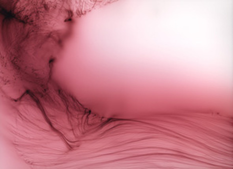
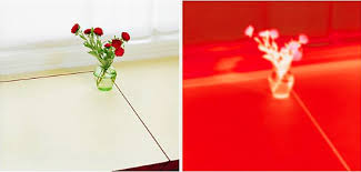
Wolfgang Tillmans, Freischwimmer 26, 2003The reason I picked this photograph is because I think it's really abstract. I like this photo a lot this is because it looks like a tree but it looks like it has water paint on it or water has been spilt on wet paint. I like this as well because I like the way it is not focus on the white. Also I like the way were it is not focus it goes from white to like pink then to a dark pink and then it goes into the pattern.
My questions would be:
|
|
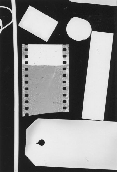
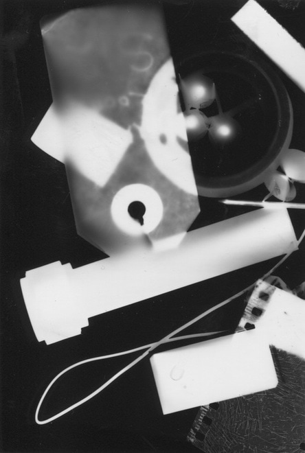
In the lesson I created 6 photograms. I like this one because everything is sorted in its own place. the light has not been to exposed, also you can see what some of the objects are. The image is high contrast with the objects set against a dark black background. Some of the objects are parallel to each other but others are set at an angle. This introduces a bit of drama into the photogram. Most of the shapes are rectangular but one of them is round. There is also a hole in the card at the bottom. This also provides some contrast. |
|
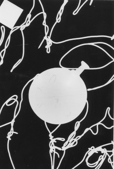
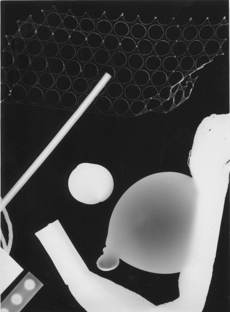
Unlike the photogram above this one is made up of curvy shapes and lines. I feel more excited to look at this photo-gram. The balloon shape in the middle is the focal point in the middle and its surrounded by lots of wavy line made by a wire mask that I fount in the dark room. it has been contrasted well. I like this photo because i like the ways there is no shadow in this photo. all it really is it is black and white. |
|
|
The thing I like in this photo-gram is that there is loads of different shapes. This is on of my favourites because where that rectangular shape is you can see through it and see the other shapes underneath it, Also I like the strip of film in the bottom right corner, I like it because as you can see half of it is a different texture to the top of the film also it is much more darker the the top of it. If I could change 1 thing about this it would be to add more objects to the photo and try different texture objects to see if the texture of the object prints on to the photo. |
|
Here is another one that I made i quite like this one because of the objects.The objects I like the most is the balloon and the object that is at the top with the hole in. I like them objects because the balloon showed up really well and people could tell that it is a balloon. Also the object at the top i like that because where it curved up in the corner you could still see the holes and the outline of the object,I also like that object because I like the way you can see the out line of the circles in the middle. WWW: that all the objects came up nice and you can tell what some of them are. EBI: that i added a bit more unique objects to the picture. |
|
Uta Barth
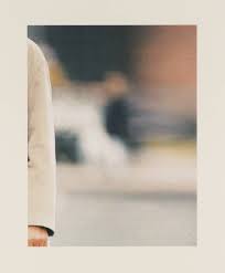
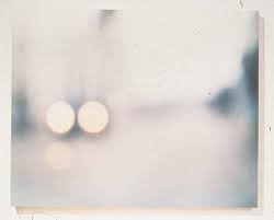
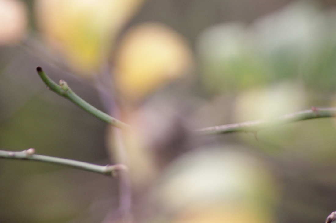
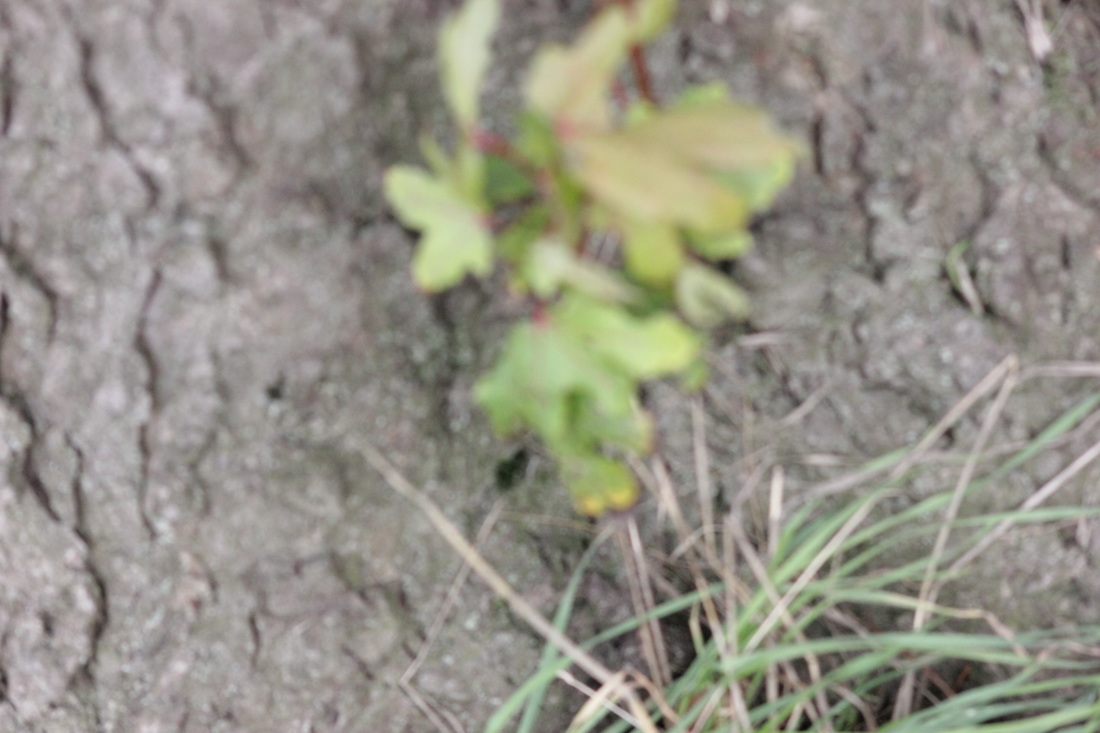
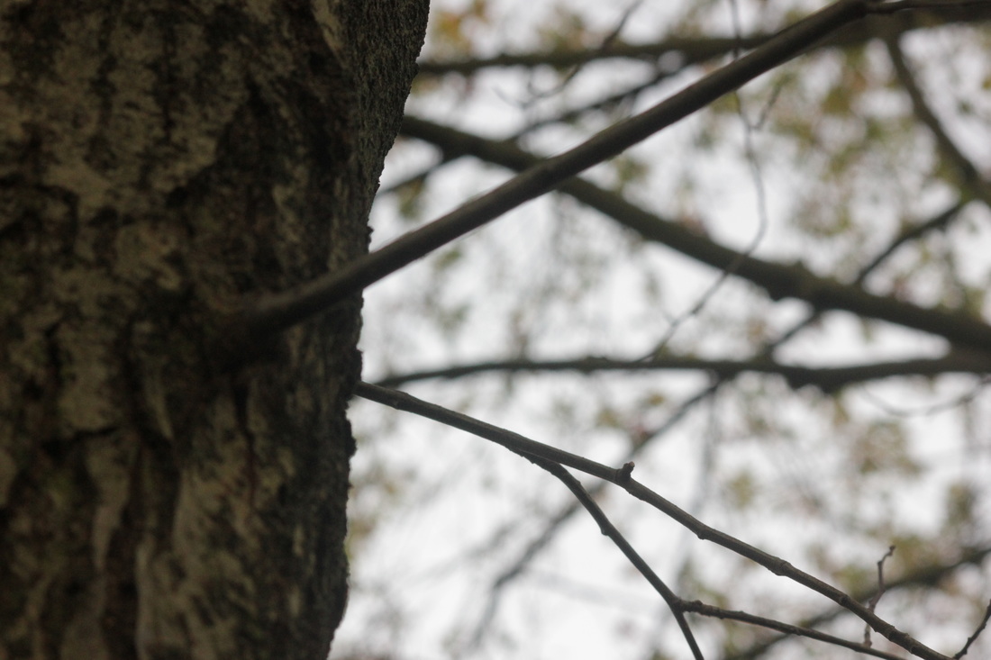
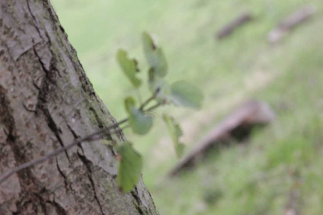
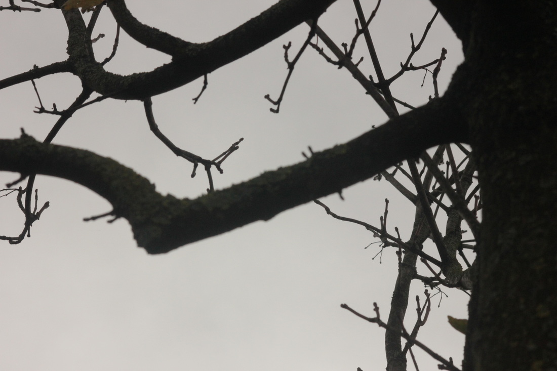
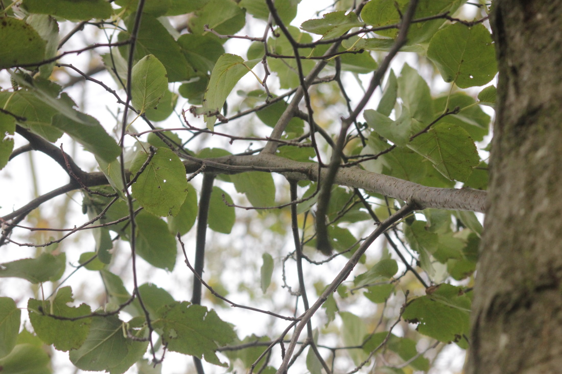
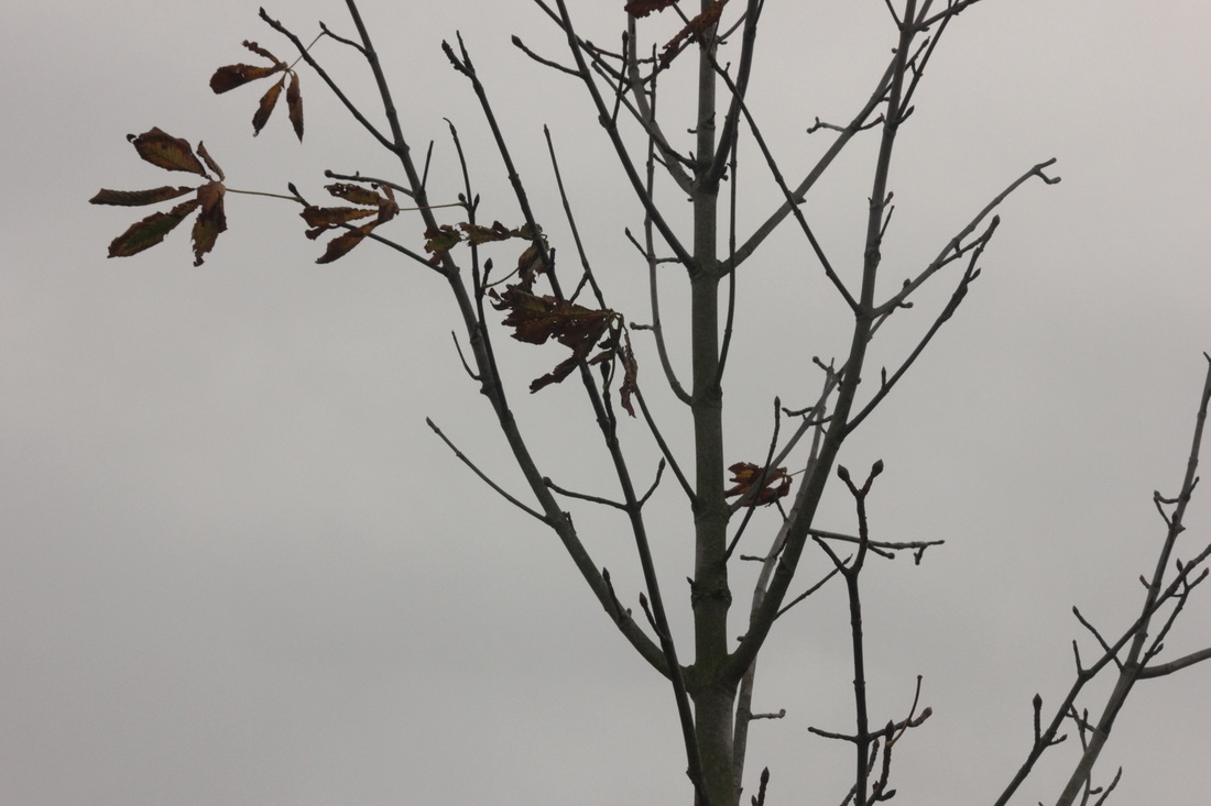
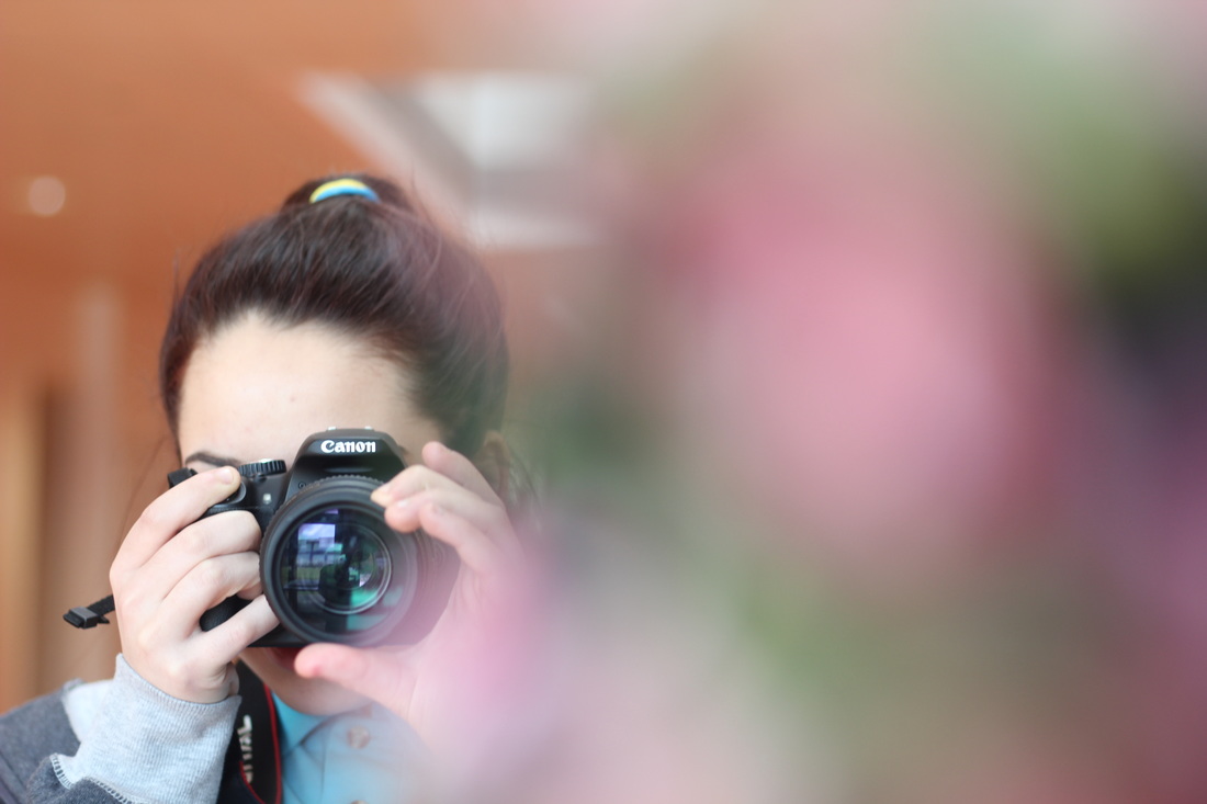
My photographs.
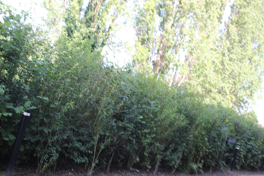
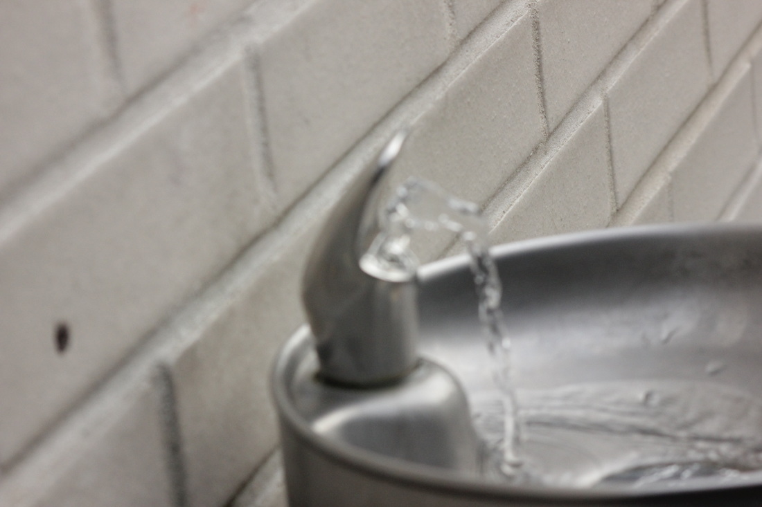
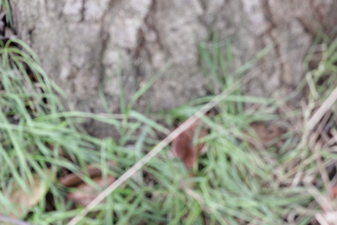
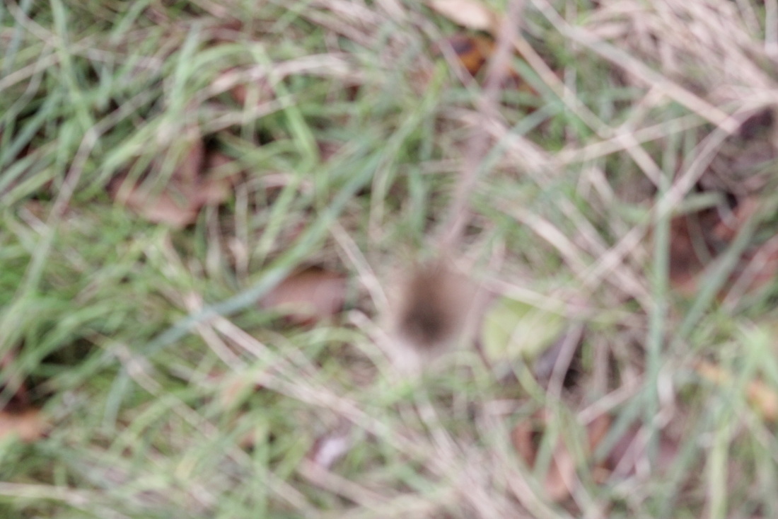
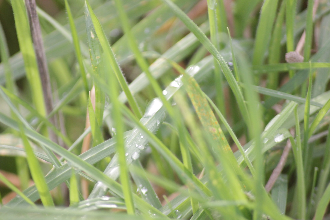
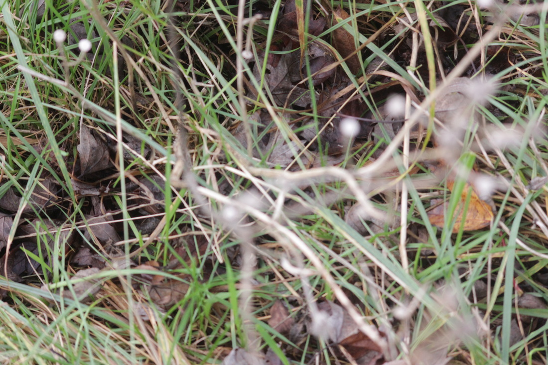
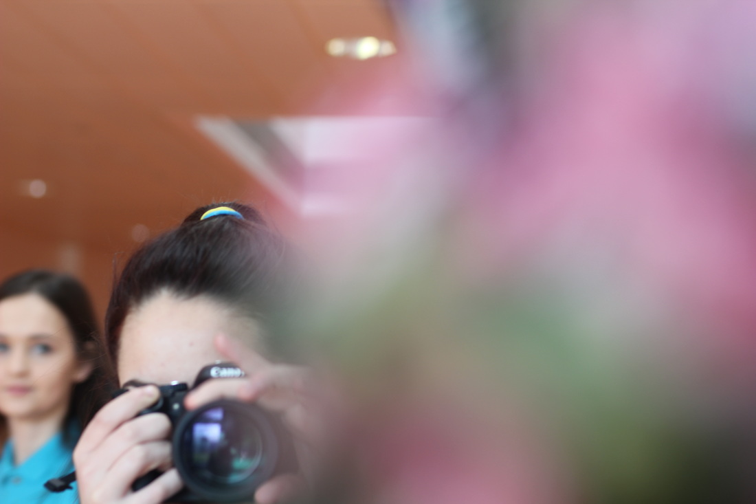
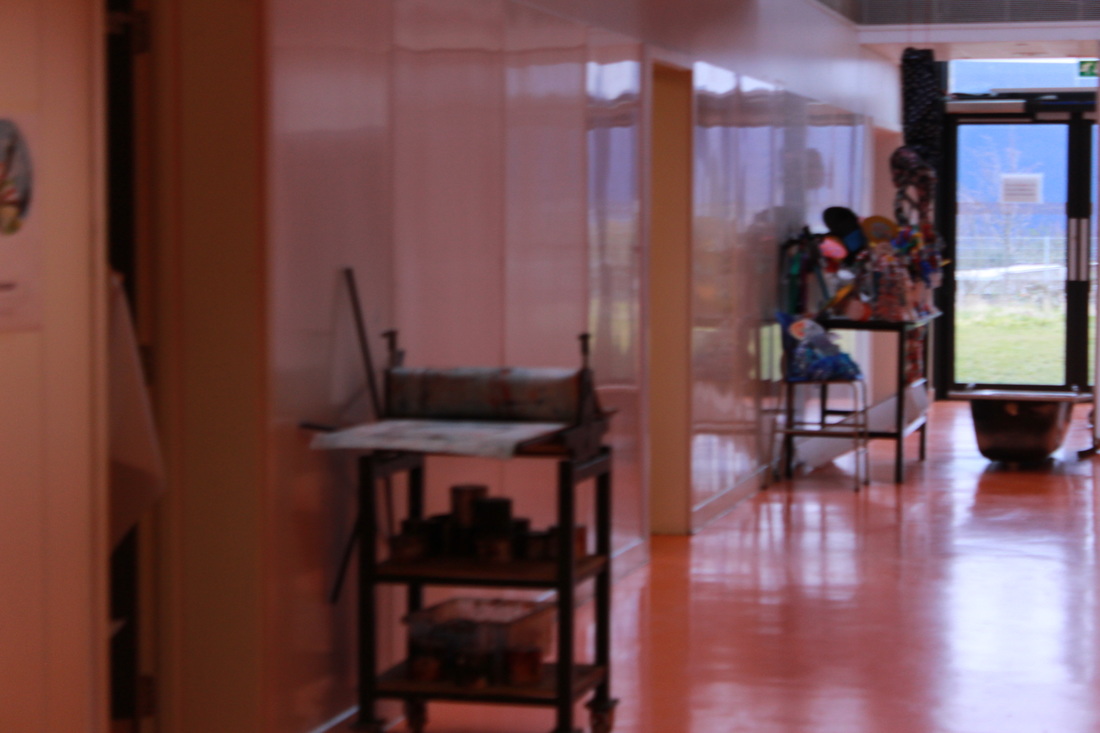
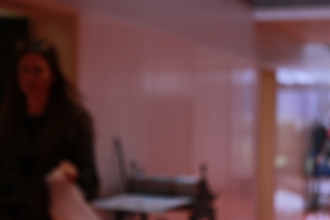
I have tried to photograph like Uta Barth with big areas out of focus.
Photographer Study
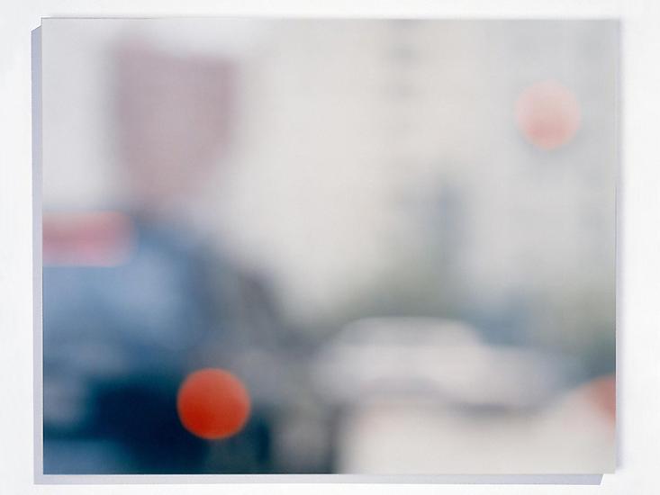
The photographer I have chosen is Ernst Haas. I chose him because I like the design of his photos.
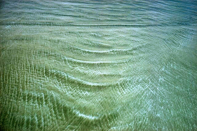
In this photograph I can see a variety of colours. I see colours mixed around together. The colours I see are brown, white, green. I can also see water on top of all the colours. The words I would use to describe this photograph are "abstract","blurry" and "colourful".All the colours mixed together.If I had to explain the photo to a person I would explain it by saying "imagine the sea with rocks underneath the water, the rocks have colours on but the rocks are blurred under the water".This image is abstract because in some ways you could not tell what it is but some other ways you could tell what the photo is.The things I recognise are the water because you can tell its water, the way it it on top of the rocks.Also I can recognise is the rocks because it looks like its underneath the water.The things that seem new to me are the colours, this is because you don't normally see like black or green under the water.
The equipment he uses was a camera,The techniques he uses was put the camera right on top of the water and kept the shutter open for longer so he could move the camera to make the blurry effect.The processes he uses was letting the water move around and then kept it open for longer and then he maybe tried to keep the shutter open for a shorter time.This affects the way we view it because we all might see different thing when we look at the photographs.This photograph reminds me of fish's swimming underneath water but lots of fish's on top of each other so you couldn't see every fish that was there.I would describe the shapes as overall and circles but then the circles are squished.The colours are fall colours.The texture I would describe it as a wet texture or bumpy because the water would make it wet and then the bumpy would come from the grass or plants on the rocks.The pattern I would describe this picture is water colours mixing together so the coloured would blur.This photograph is different from real life because the rock don't look real because if it was in real life you would be able to see the water coming on and off the rocks.Also the water makes it look more fake because the water has been captured and the water is not moving.The things that interest me the most are all of it this is because when it is full screen you can not really tell what it is but when its not you can sort of tell what the image is.I also like all the colours on the rocks you can see the reflection of the rocks and you can see where the colours might of leaked of one rock and blended in with the water.Another thing is the colour this is because rocks are not normally all them colours like red, brown, orange and green.
In the photograph the space in some places where there aren't any rocks, but the rocks are in top right and bottom right corners and across the bottom of the photograph there are rocks there but the rest like top left corner there are no rocks.The part that strikes me most in the photographs is the colours how it blends in with the water and how it mix's around in the water I found that interesting because it make the photograph more abstract and interesting.If I could ask any questions to the photographers I would ask:
If I had to give this photo a title I would give it "under the water" I decided this title because where its to do with water and the rocks underneath the water.If I had to think of any other titles I would think of "colourful rocks" this is because the rocks are different colours, another title would be "water rocks" this is because the rocks are underneath the water and the rocks are on top of the water.The thing I think is going on is that the photographer has fount the water and rocks and he liked it and took the photograph.I arrived at this idea because when I was looking at the photograph I was imaging the photographer taking this and that is what I saw in my mind.I think this photograph is about some ones feelings, I come up with that idea because I can see him hurt,sad and upset and then rocks falling on him and taking all the pain away but then I can also see him being happy.If I was inside the photo I imagine it to be a peaceful and quite place, I see this because it might be a sad and hurtful time for him and he might be in pain from the rocks falling on top of him.I suppose he made this photograph to shows his feeling. I think that because when I see water and rocks like by a river or somewhere I normally see some one there that is upset or sad and crying so it makes me think he was taking it when he was sad or upset.I think it would feel depressing if it had to live in this photograph this is because I feel like when he took it he was sad or upset.
The things I think are effective about this photograph is all the colours and water, when the colours are blended in with the water and when it all gets mixed with the water.But the things I think that don't work so well is the rocks because I think that there is to many rocks I think that they should be spread out.I think other people would say different this is because we all have different opinions and we all think different like some people would say its not the rocks and water but then other people might say the same it it water and rocks, people might think they are fish's instead of the rocks and water.The thing I think are worth remembering about this photograph is all the colours that are blended in with the water and all the thoughts you have about this photograph this is because all different people would think about the photo and the thought you think of makes you imaginative. The thing I learnt from exploring this piece of work I that you can be as abstract as you want with anything this is because from one photograph you can see more then one meaning for it and you can see different things if you think like that.Also what I learnt was that one photo can impress your feeling in so many different ways for examples your emotions this is because in this photograph you can be happy and sad depends on what way you think because if you think in a happy way it makes you learn how to be creative in a photograph but then is you feel bad and sad and upset it's teaching you to be imagining and to impress and show how you feel through a photograph .Also another thing I learnt was how to develop you description about a photo for example you just pick on thing on the photograph and write about it in detail. but I also learnt how to see a photograph in more then one view like for example I could see rocks and water but also I could see a loud of different fish's so that also teaches me how to be imaginative and to explore the photograph in more then one way and show more feelings about the photograph.
In this photograph I can see a variety of colours. I see colours mixed around together. The colours I see are brown, white, green. I can also see water on top of all the colours. The words I would use to describe this photograph are "abstract","blurry" and "colourful".All the colours mixed together.If I had to explain the photo to a person I would explain it by saying "imagine the sea with rocks underneath the water, the rocks have colours on but the rocks are blurred under the water".This image is abstract because in some ways you could not tell what it is but some other ways you could tell what the photo is.The things I recognise are the water because you can tell its water, the way it it on top of the rocks.Also I can recognise is the rocks because it looks like its underneath the water.The things that seem new to me are the colours, this is because you don't normally see like black or green under the water.
The equipment he uses was a camera,The techniques he uses was put the camera right on top of the water and kept the shutter open for longer so he could move the camera to make the blurry effect.The processes he uses was letting the water move around and then kept it open for longer and then he maybe tried to keep the shutter open for a shorter time.This affects the way we view it because we all might see different thing when we look at the photographs.This photograph reminds me of fish's swimming underneath water but lots of fish's on top of each other so you couldn't see every fish that was there.I would describe the shapes as overall and circles but then the circles are squished.The colours are fall colours.The texture I would describe it as a wet texture or bumpy because the water would make it wet and then the bumpy would come from the grass or plants on the rocks.The pattern I would describe this picture is water colours mixing together so the coloured would blur.This photograph is different from real life because the rock don't look real because if it was in real life you would be able to see the water coming on and off the rocks.Also the water makes it look more fake because the water has been captured and the water is not moving.The things that interest me the most are all of it this is because when it is full screen you can not really tell what it is but when its not you can sort of tell what the image is.I also like all the colours on the rocks you can see the reflection of the rocks and you can see where the colours might of leaked of one rock and blended in with the water.Another thing is the colour this is because rocks are not normally all them colours like red, brown, orange and green.
In the photograph the space in some places where there aren't any rocks, but the rocks are in top right and bottom right corners and across the bottom of the photograph there are rocks there but the rest like top left corner there are no rocks.The part that strikes me most in the photographs is the colours how it blends in with the water and how it mix's around in the water I found that interesting because it make the photograph more abstract and interesting.If I could ask any questions to the photographers I would ask:
- what made you thing to take a photograph like this?
- how many attempts did it tale to make it right?
- what photographer did you look up to?
If I had to give this photo a title I would give it "under the water" I decided this title because where its to do with water and the rocks underneath the water.If I had to think of any other titles I would think of "colourful rocks" this is because the rocks are different colours, another title would be "water rocks" this is because the rocks are underneath the water and the rocks are on top of the water.The thing I think is going on is that the photographer has fount the water and rocks and he liked it and took the photograph.I arrived at this idea because when I was looking at the photograph I was imaging the photographer taking this and that is what I saw in my mind.I think this photograph is about some ones feelings, I come up with that idea because I can see him hurt,sad and upset and then rocks falling on him and taking all the pain away but then I can also see him being happy.If I was inside the photo I imagine it to be a peaceful and quite place, I see this because it might be a sad and hurtful time for him and he might be in pain from the rocks falling on top of him.I suppose he made this photograph to shows his feeling. I think that because when I see water and rocks like by a river or somewhere I normally see some one there that is upset or sad and crying so it makes me think he was taking it when he was sad or upset.I think it would feel depressing if it had to live in this photograph this is because I feel like when he took it he was sad or upset.
The things I think are effective about this photograph is all the colours and water, when the colours are blended in with the water and when it all gets mixed with the water.But the things I think that don't work so well is the rocks because I think that there is to many rocks I think that they should be spread out.I think other people would say different this is because we all have different opinions and we all think different like some people would say its not the rocks and water but then other people might say the same it it water and rocks, people might think they are fish's instead of the rocks and water.The thing I think are worth remembering about this photograph is all the colours that are blended in with the water and all the thoughts you have about this photograph this is because all different people would think about the photo and the thought you think of makes you imaginative. The thing I learnt from exploring this piece of work I that you can be as abstract as you want with anything this is because from one photograph you can see more then one meaning for it and you can see different things if you think like that.Also what I learnt was that one photo can impress your feeling in so many different ways for examples your emotions this is because in this photograph you can be happy and sad depends on what way you think because if you think in a happy way it makes you learn how to be creative in a photograph but then is you feel bad and sad and upset it's teaching you to be imagining and to impress and show how you feel through a photograph .Also another thing I learnt was how to develop you description about a photo for example you just pick on thing on the photograph and write about it in detail. but I also learnt how to see a photograph in more then one view like for example I could see rocks and water but also I could see a loud of different fish's so that also teaches me how to be imaginative and to explore the photograph in more then one way and show more feelings about the photograph.
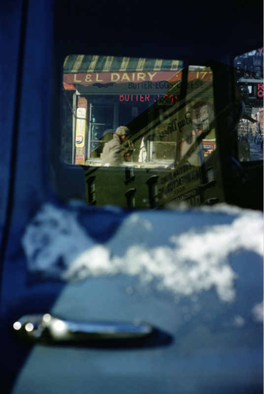
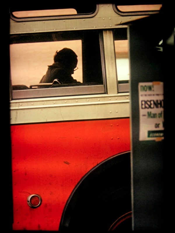
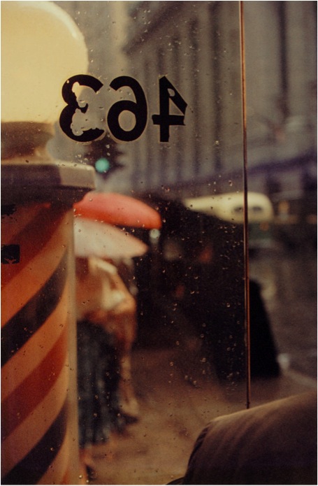
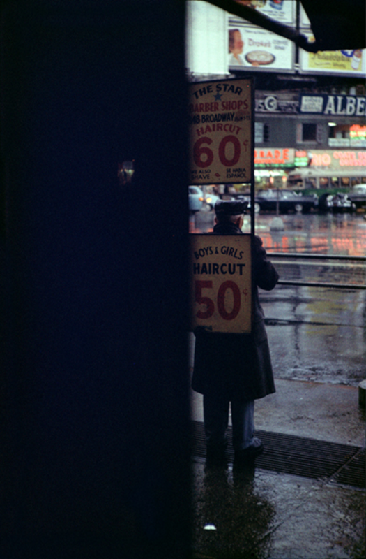
SAUL LEITER
|
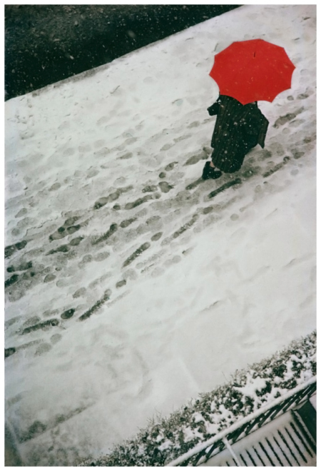
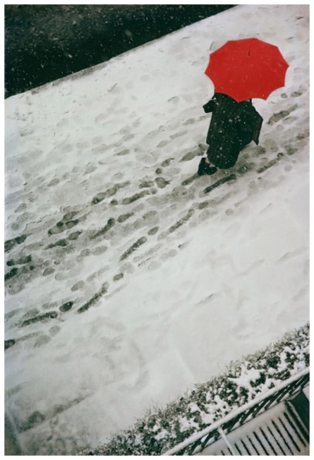
I like this photograph because it is only showing half of the person.I also like it because the photograph is is black and white but then it has one other bright colour in the photo that makes it stand out.I choose this photograph because it stand out from all the other photo because of the colours.The thing what is unusable about this photograph that it all black and whit and that the person is wearing black and then the umbrella standing out because they could of used a black or white umbrella.One of the formal elements that are being used is tone, this is being used on the snow and the person because the snow is whit and then on the person straight away it goes to black so the tones combined together.The things i think that are important are the umbrella and the colours.They are abstract because the way he uses black and white and then add one bright colour to it.
|
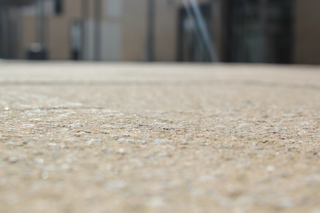
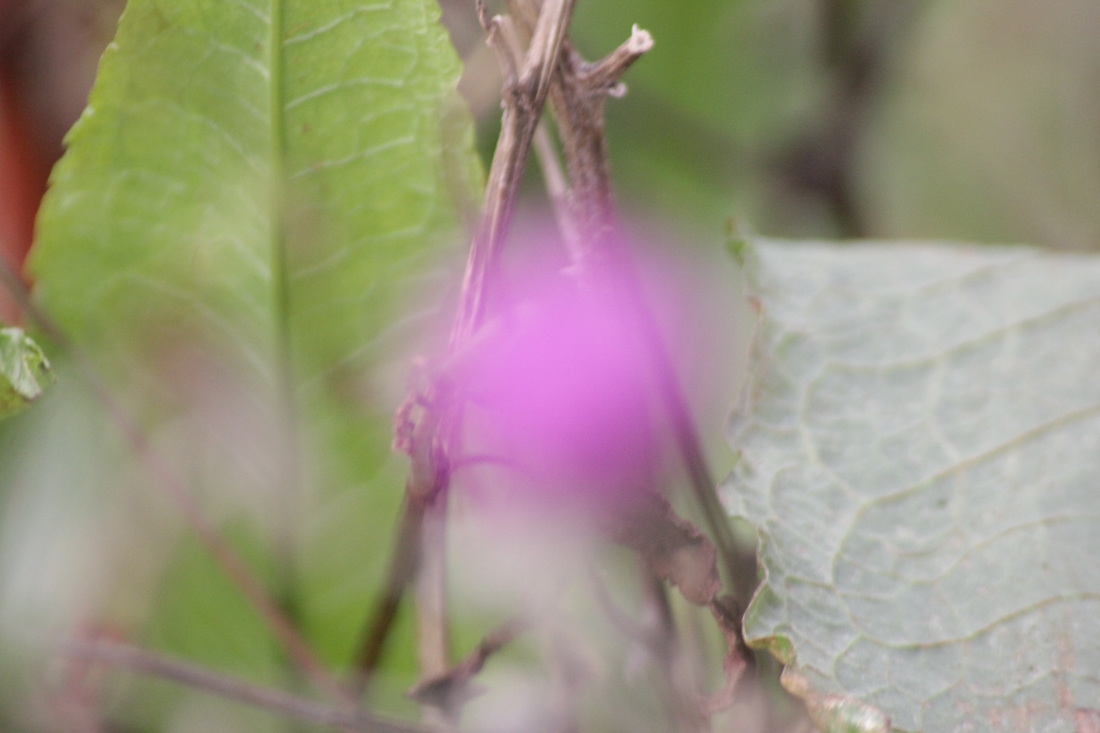
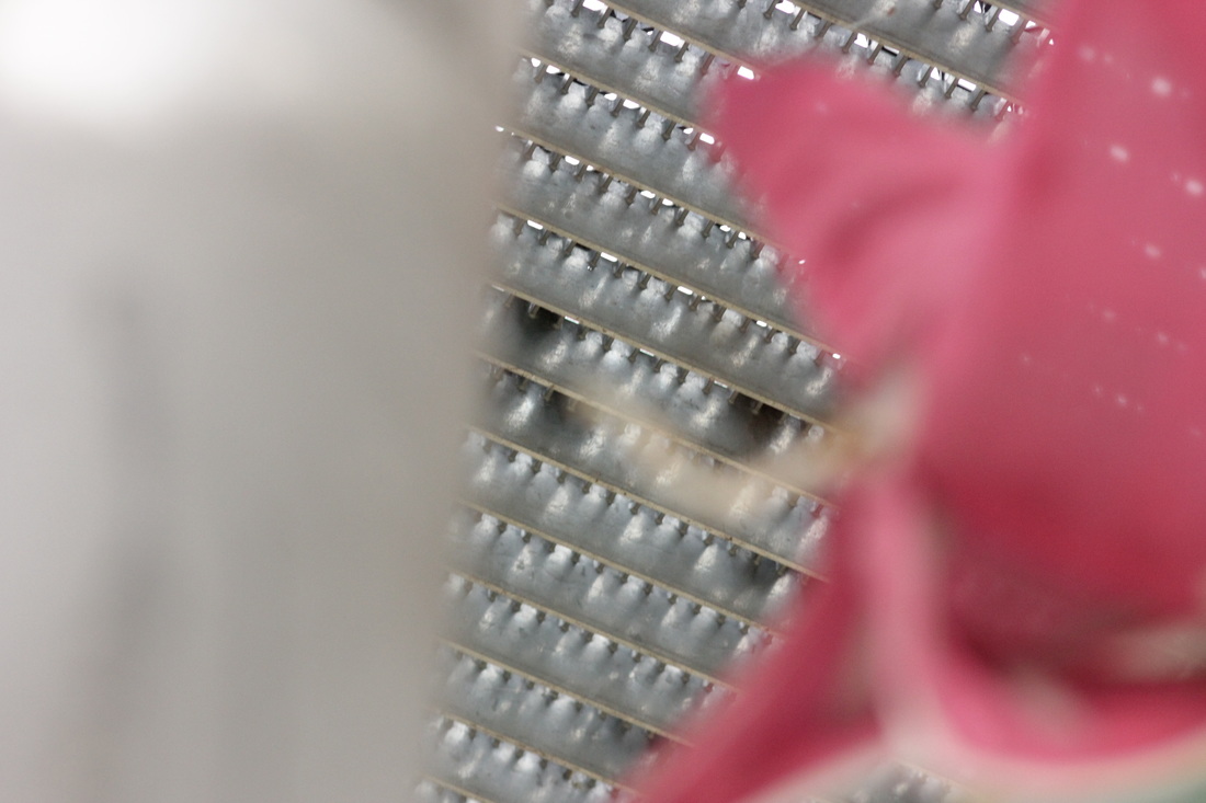
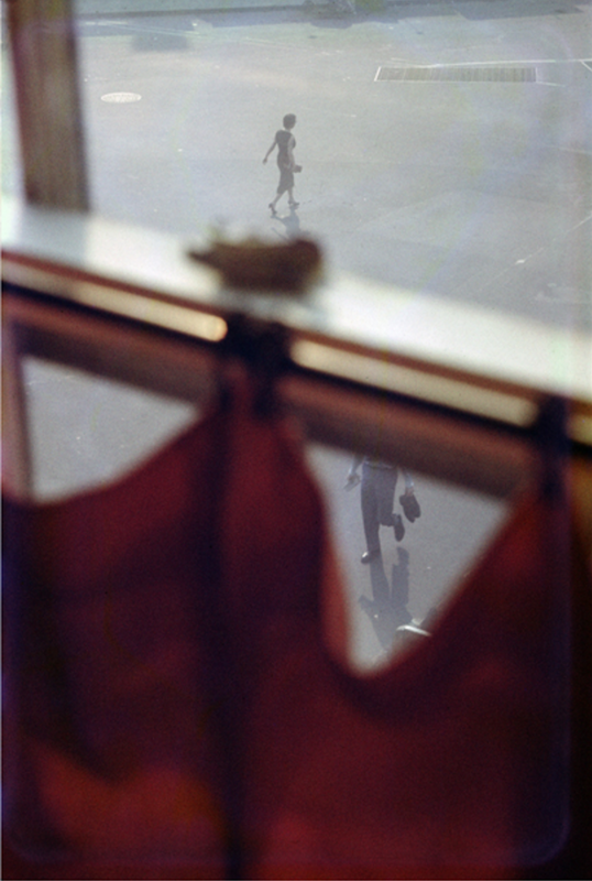
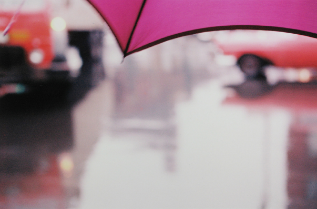
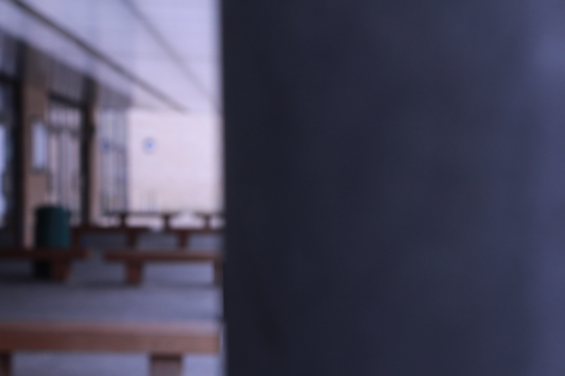
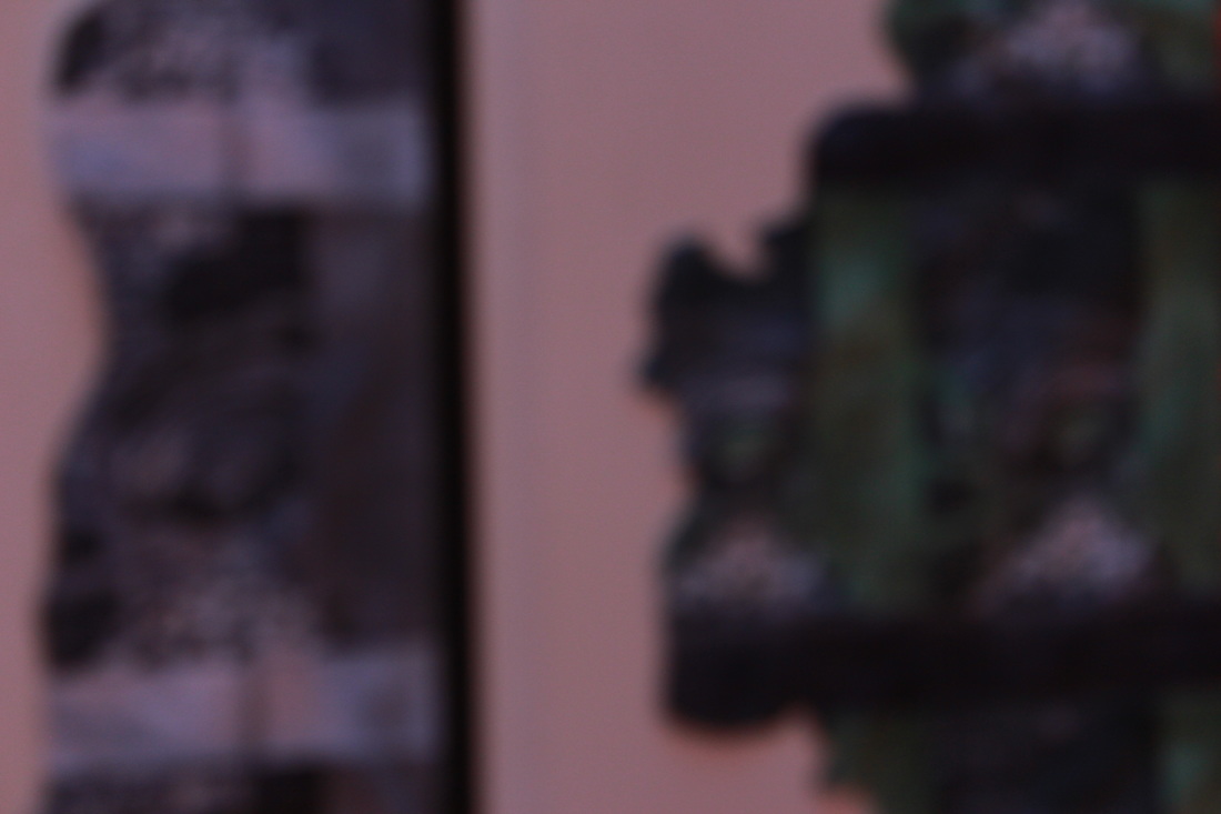
Apertures experiments
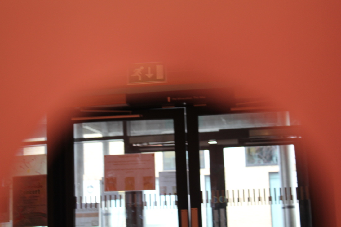
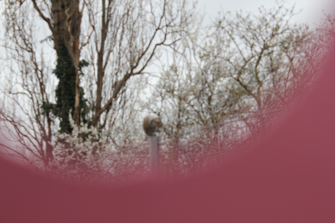
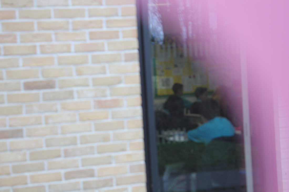
In school I decided take pictures inspired by Saul Leiter. I had a piece of card and on the card I to cut out a circle and then put it over the lends. The background had to be in focus and the coloured card had to be out of focus.

|
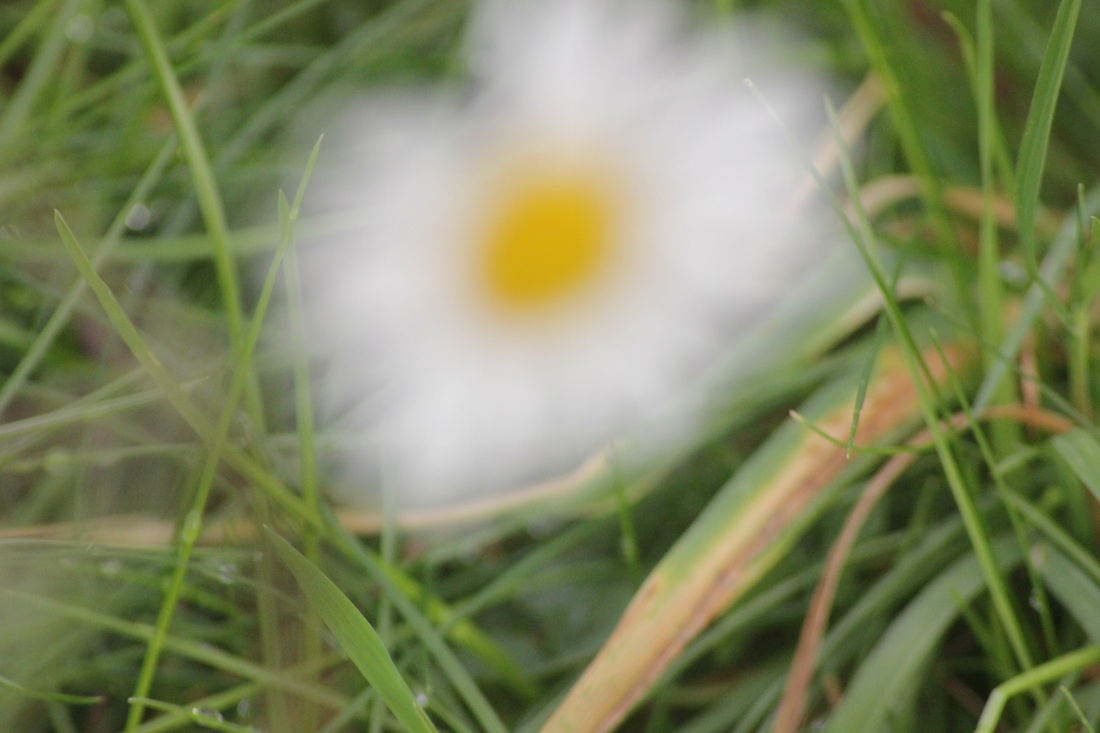
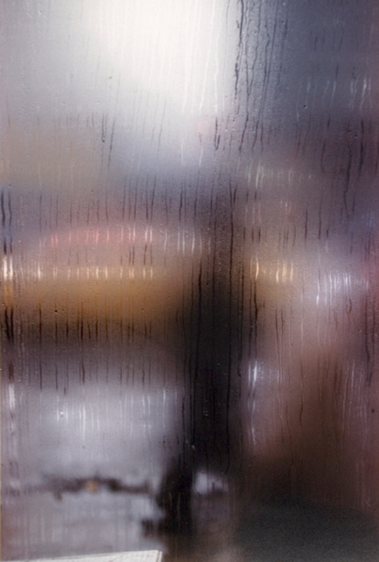
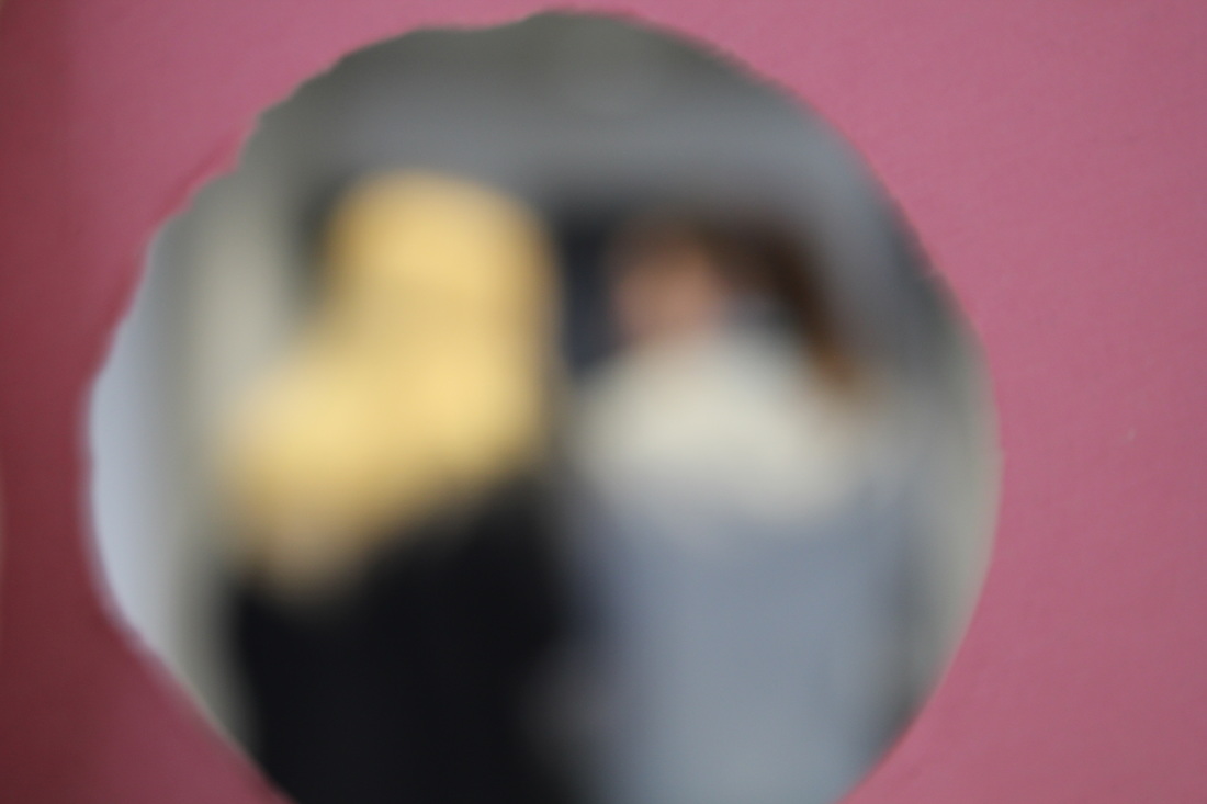
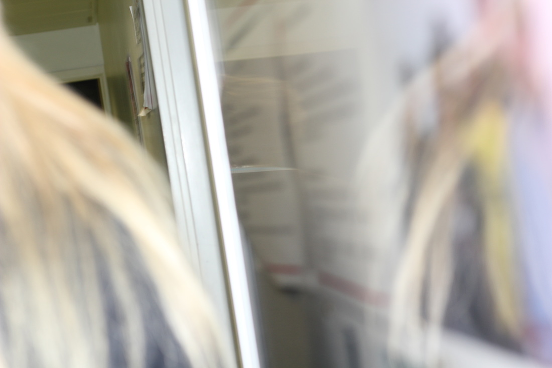
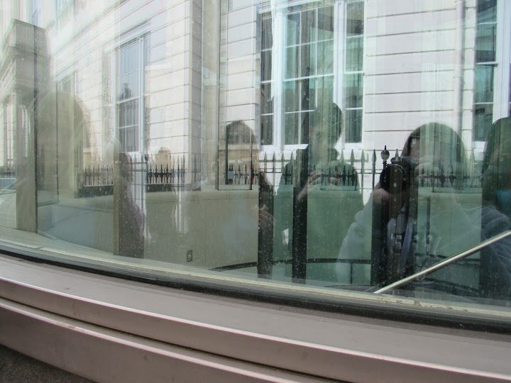
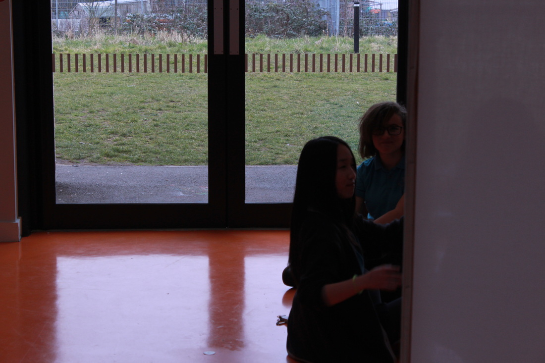
This is my favourite photo I took. This is because I like the way the coloured card is in of focus and the background is out of focus. I also like it because you can tell that it is two people inside of the circle even though it is out of focus. But the thing I don't like about this photo is the background is out of focus but I think it is too much out of focus. Another reason why is that the colour card is darken on one side then the other side. |
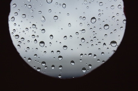
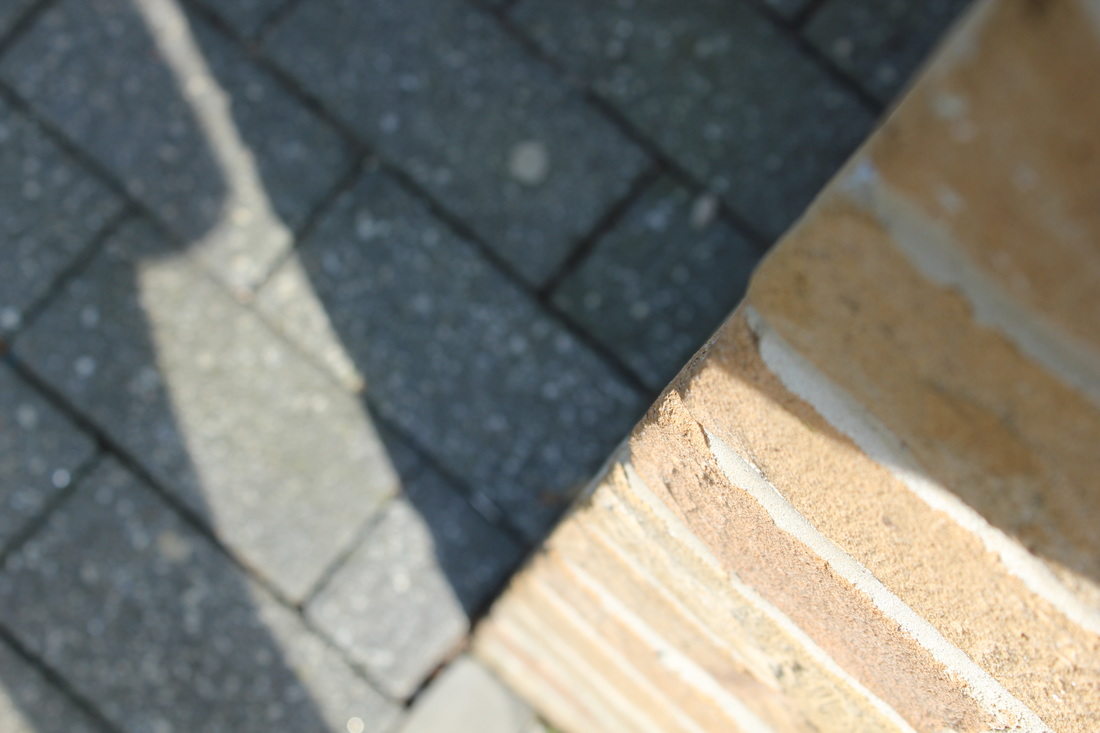
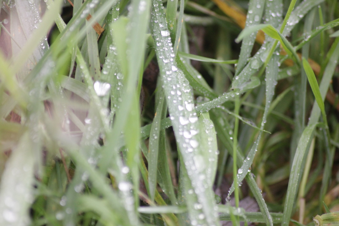
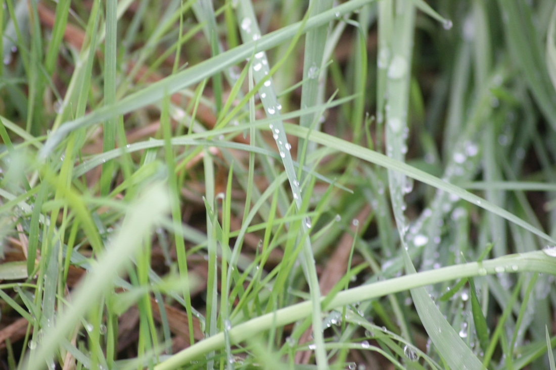
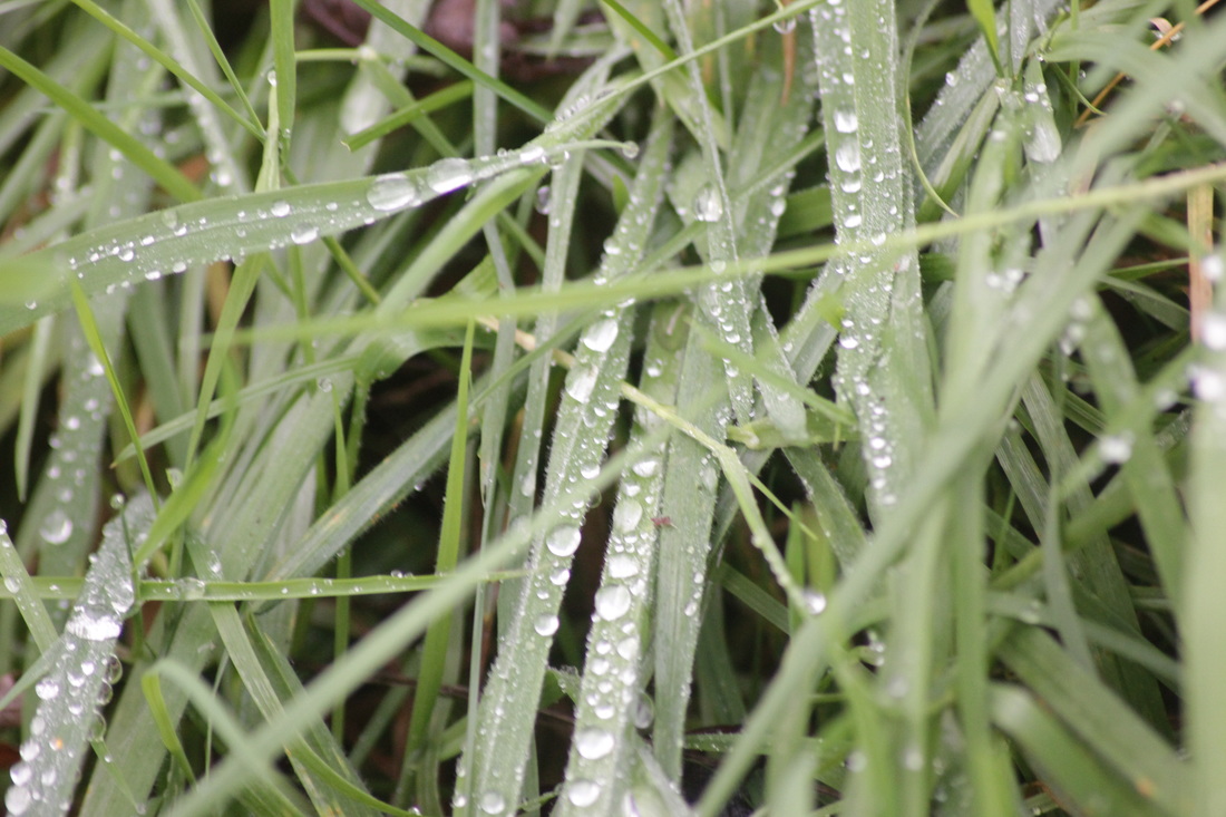
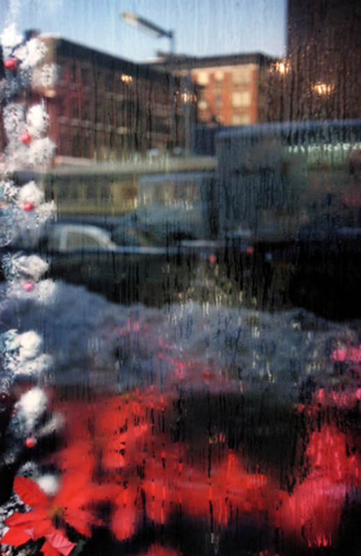
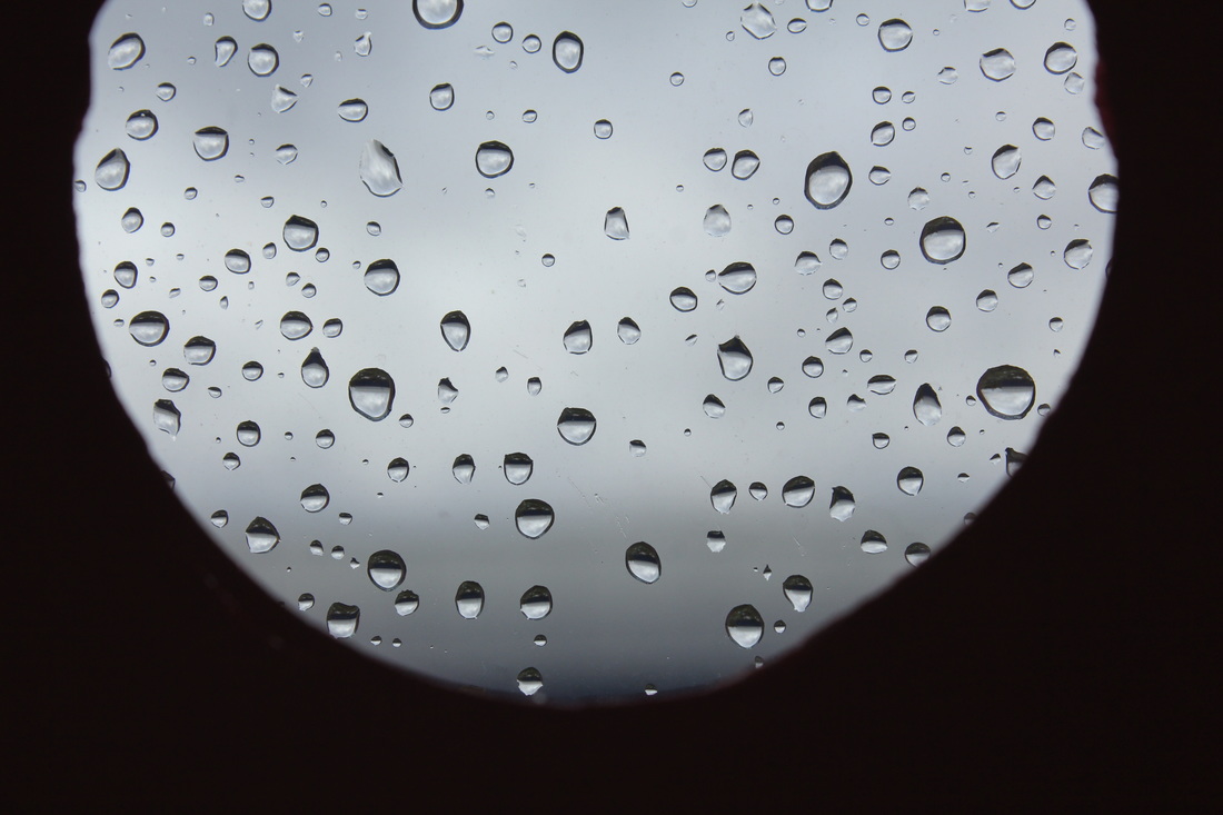
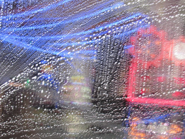
I like this photograph because of the rain drops,
I like it because even though the rain drops are in focus the background behind the rain drop is out of focus. The thing I don't like is the colours and the circle because it was meant to be jet black but it didn't come out the way I wanted it.
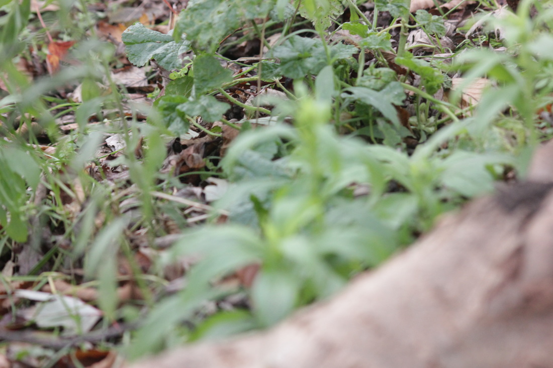
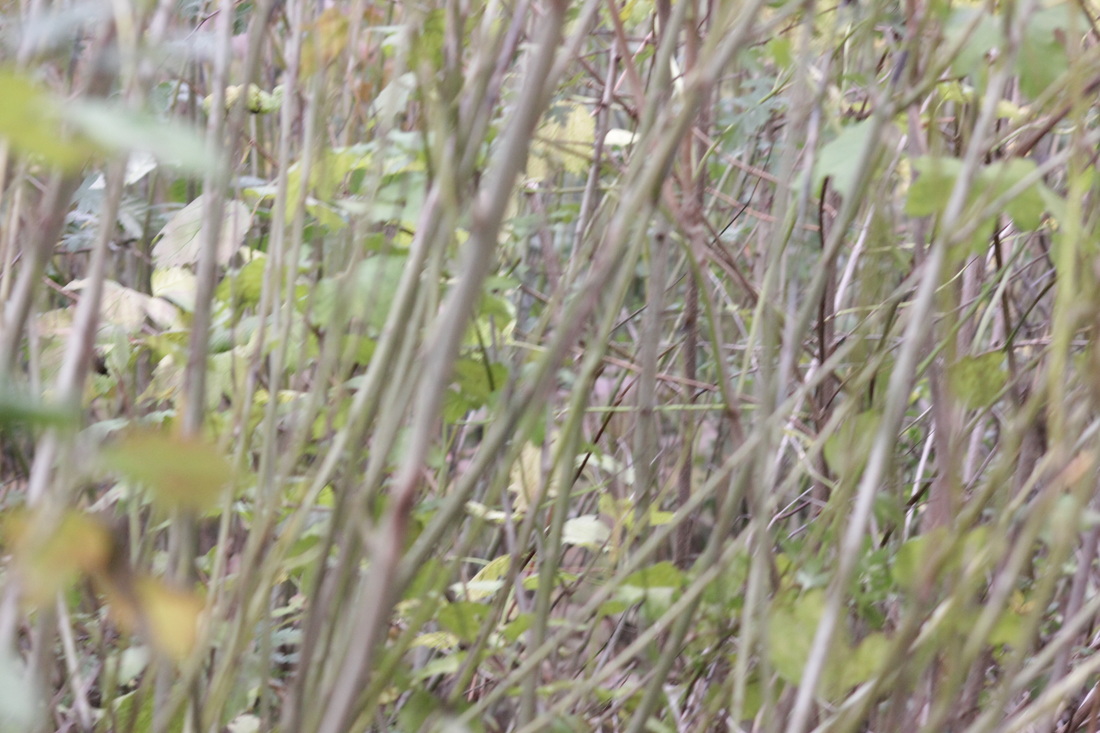
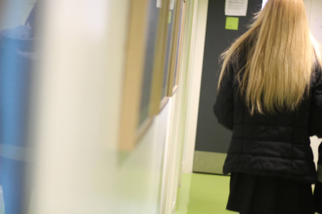
More Saul Leiter inspired photos

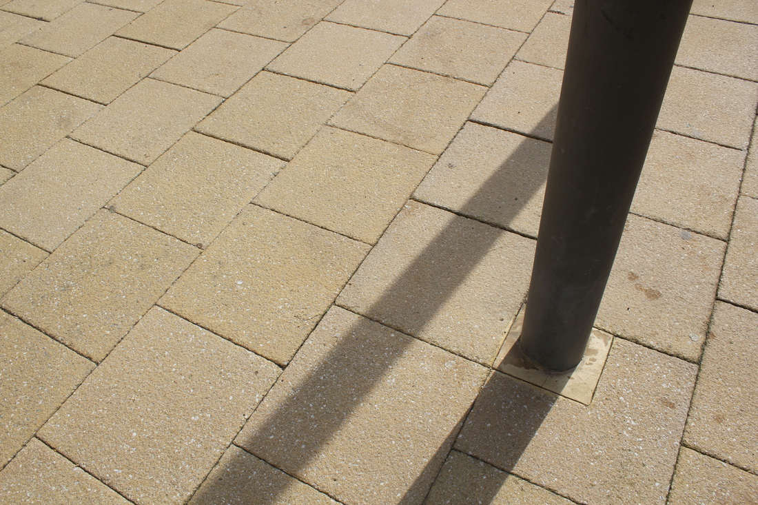
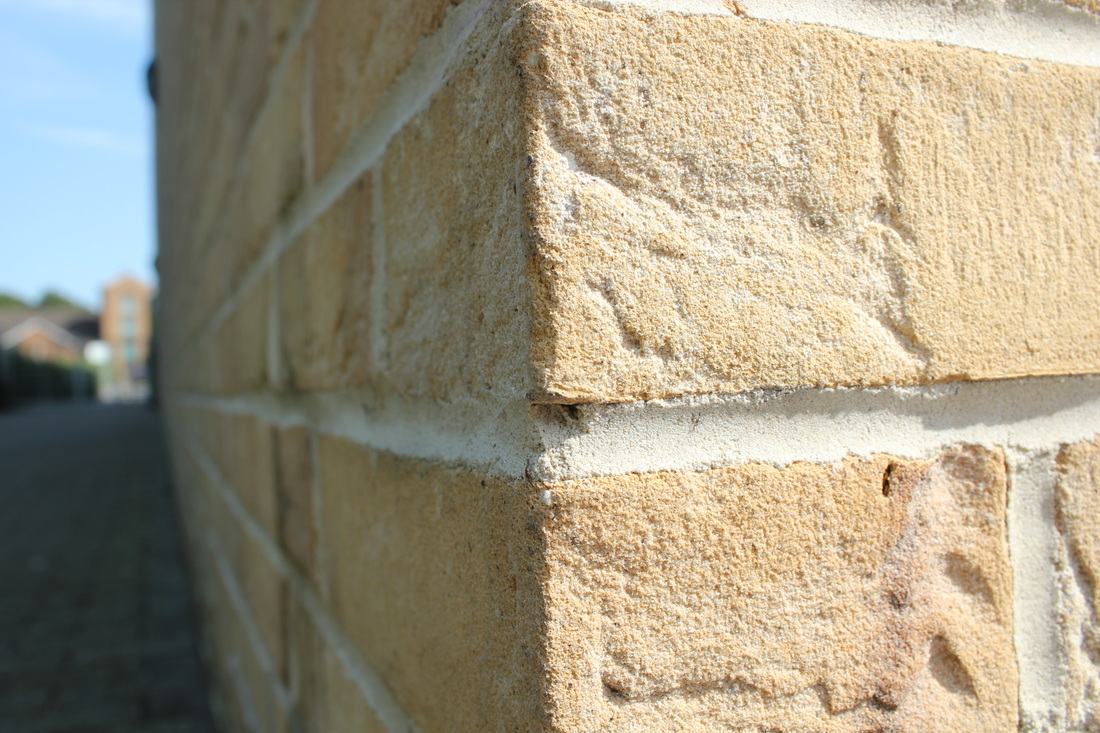
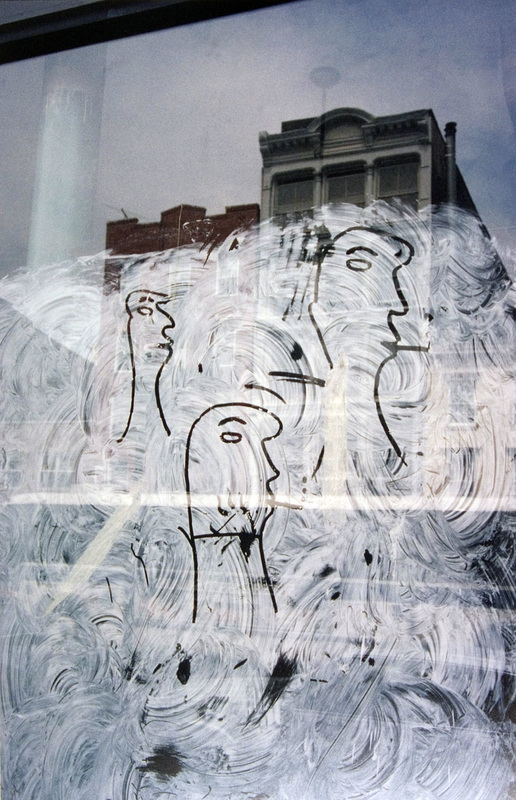
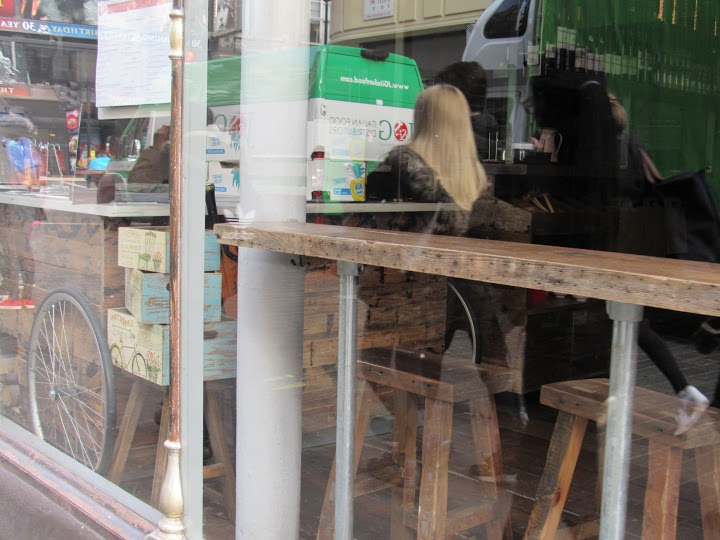
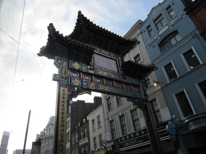
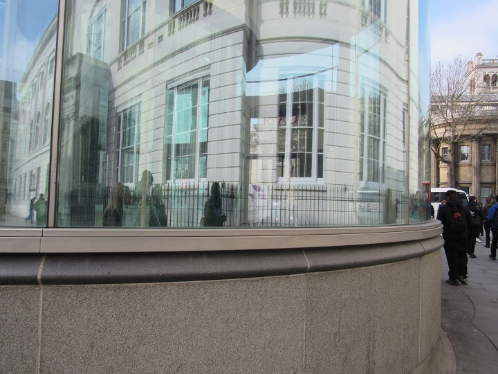
PHOTOGRAPHY TRIP.
We visited the Photographers Gallery to see the Saul Leiter exhibition.
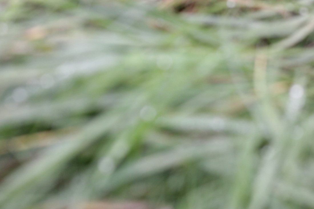
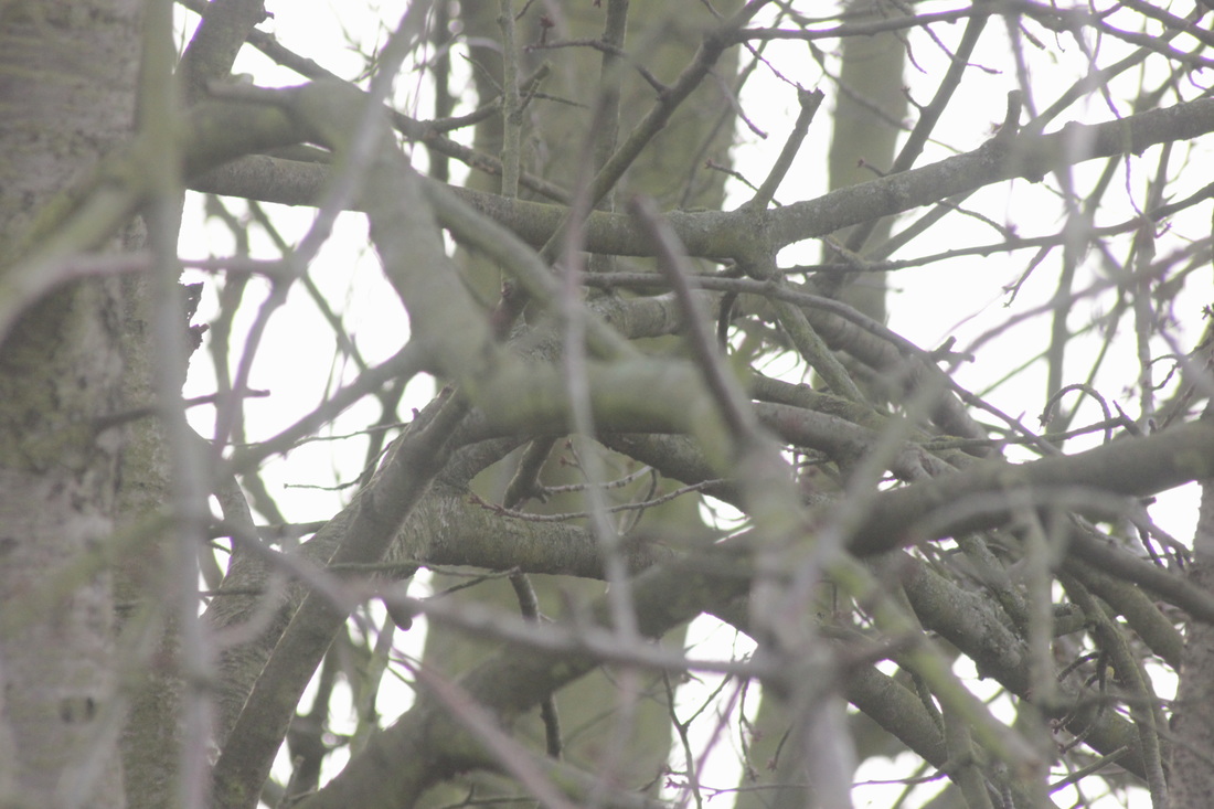
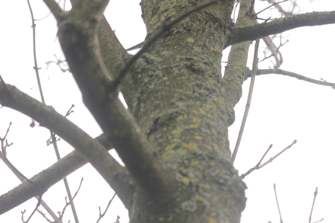
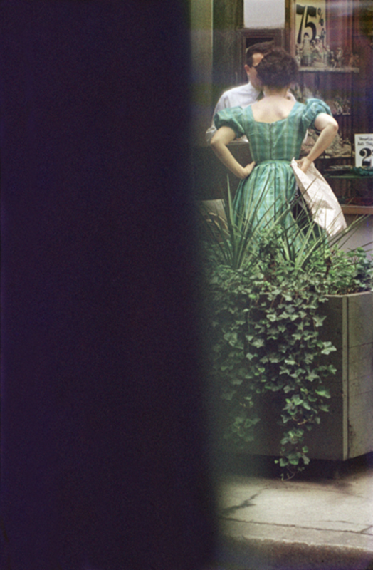
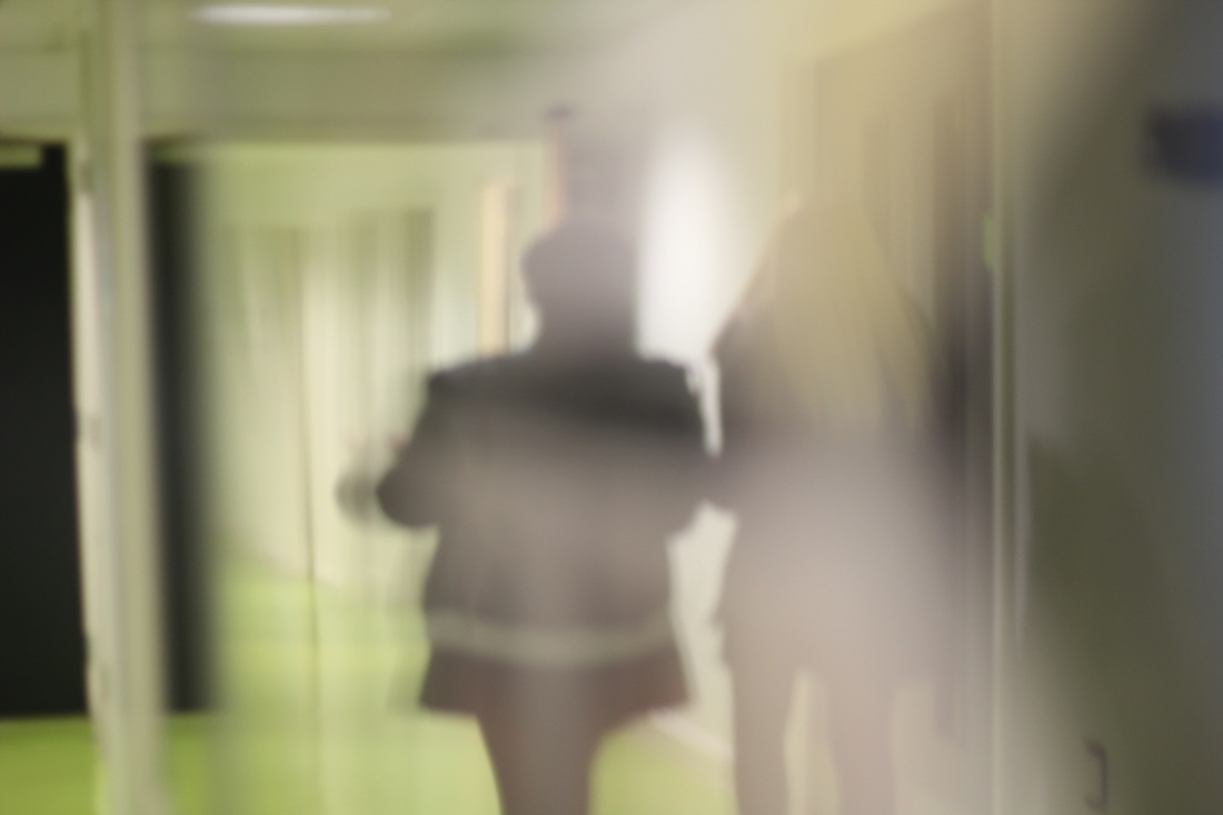
Another photo shoot back at school
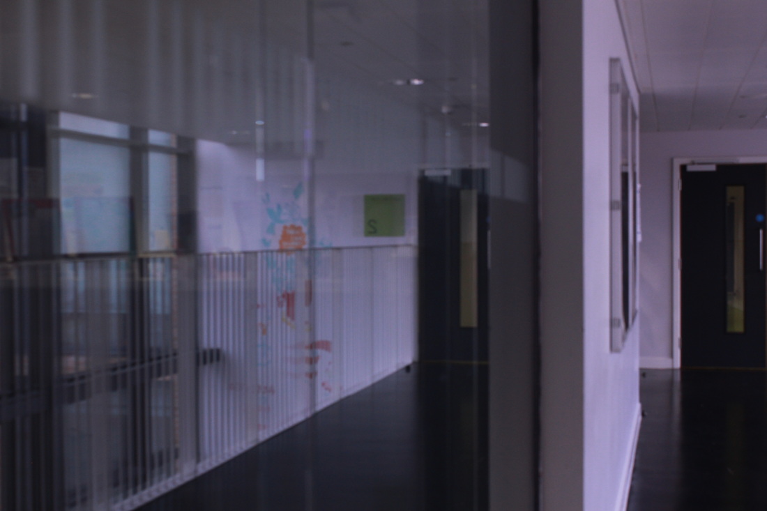
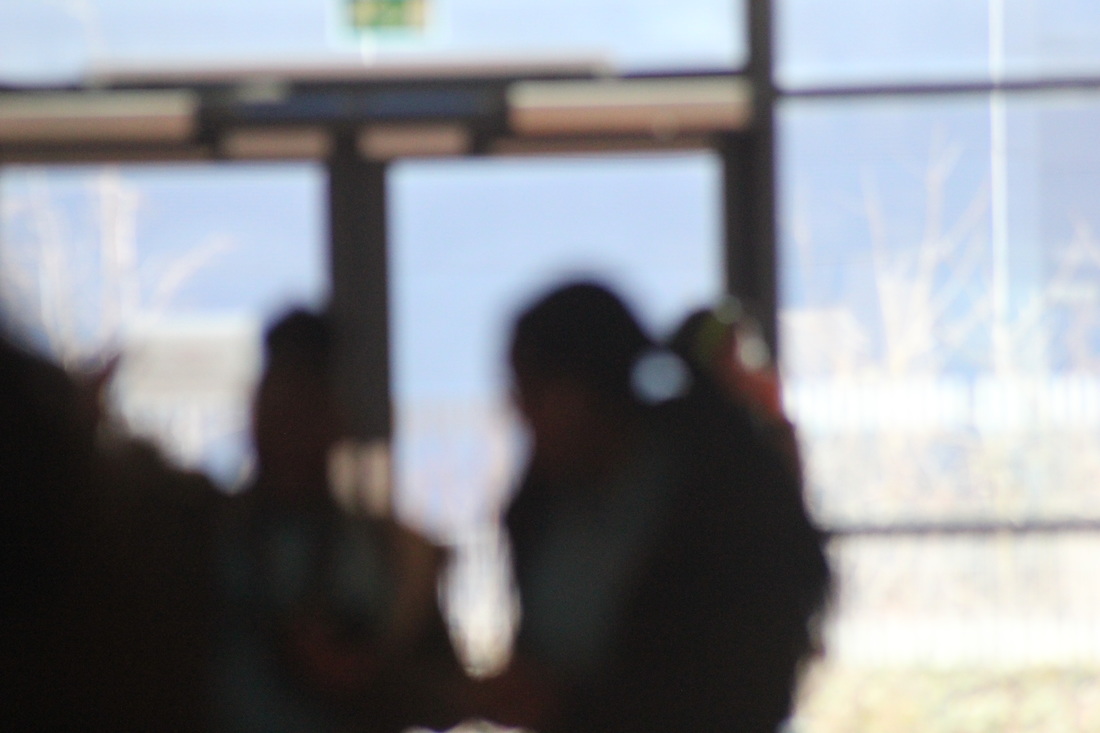
These were a bit too dark to be useful.
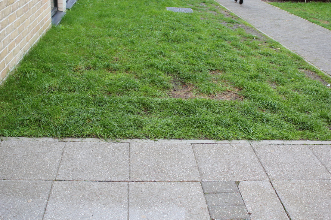
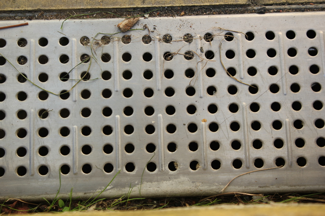
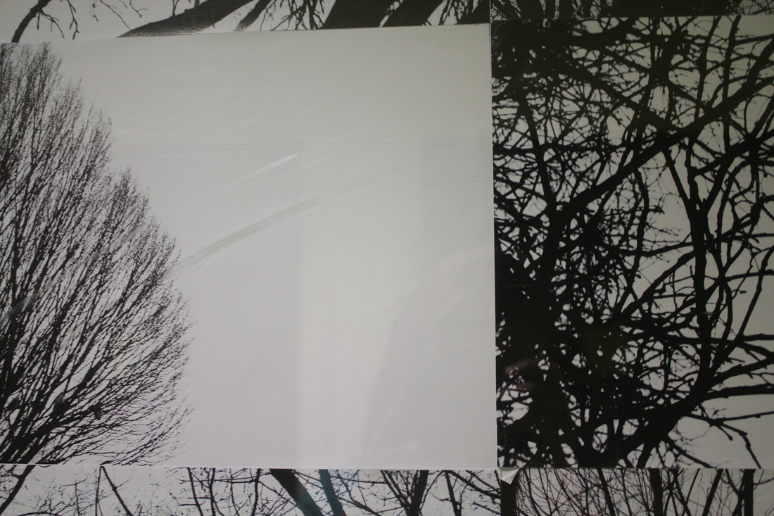
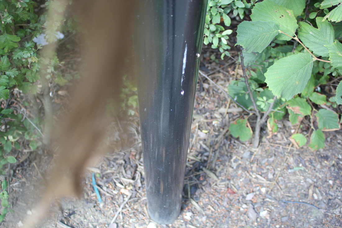
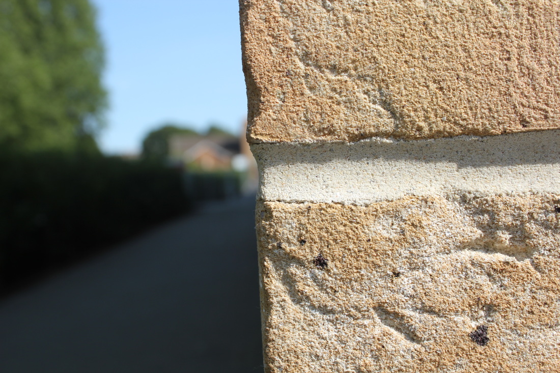
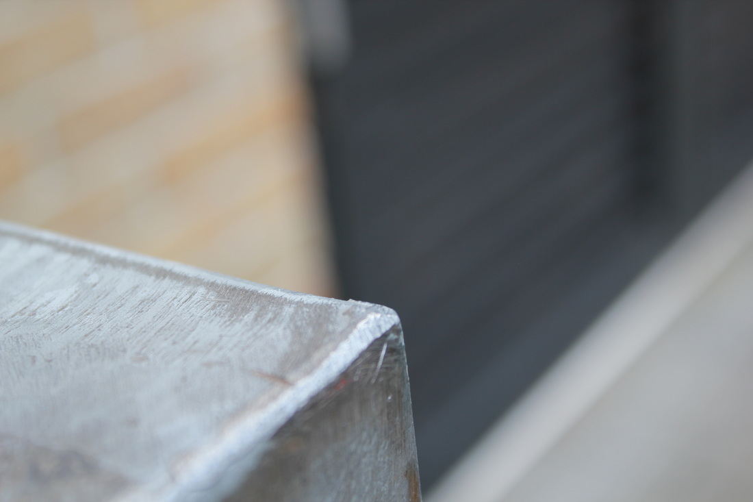
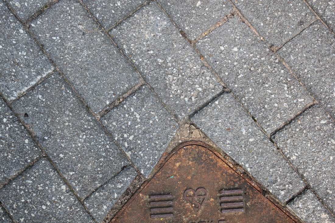
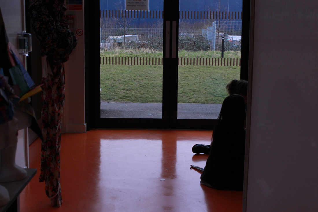
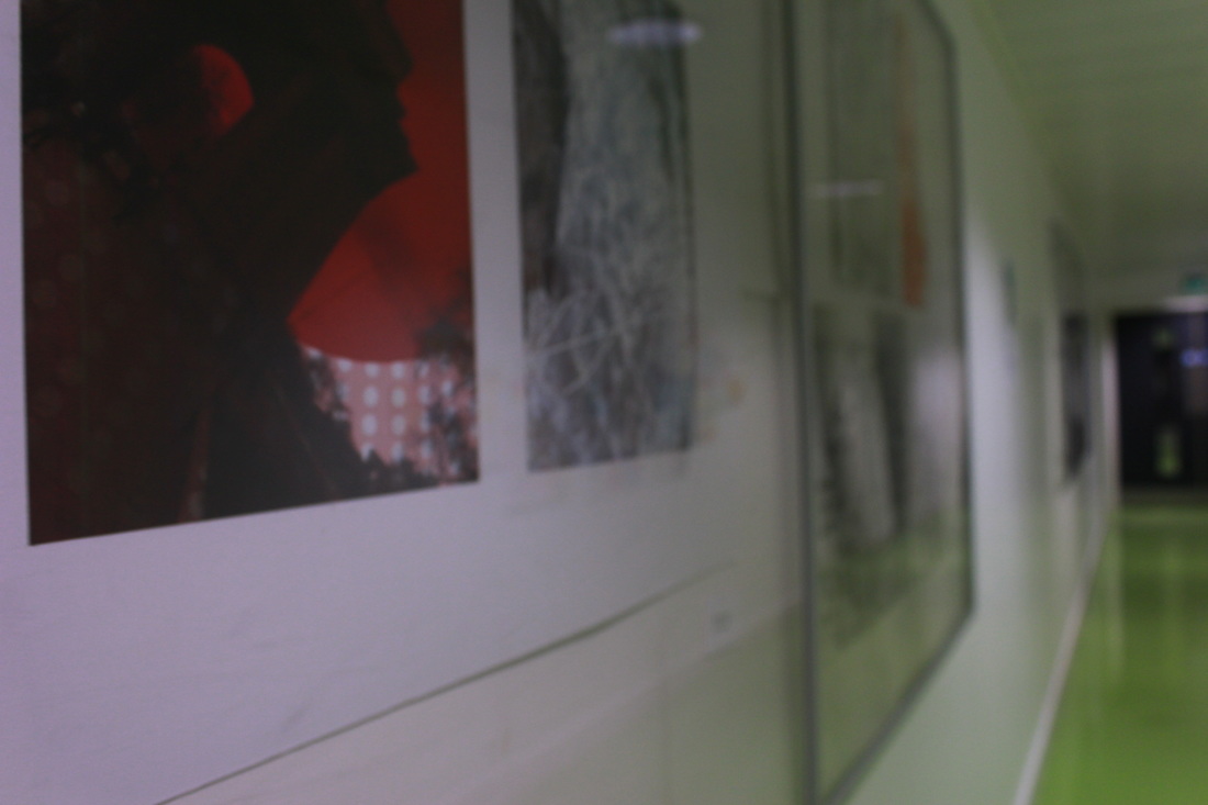
My final outcome
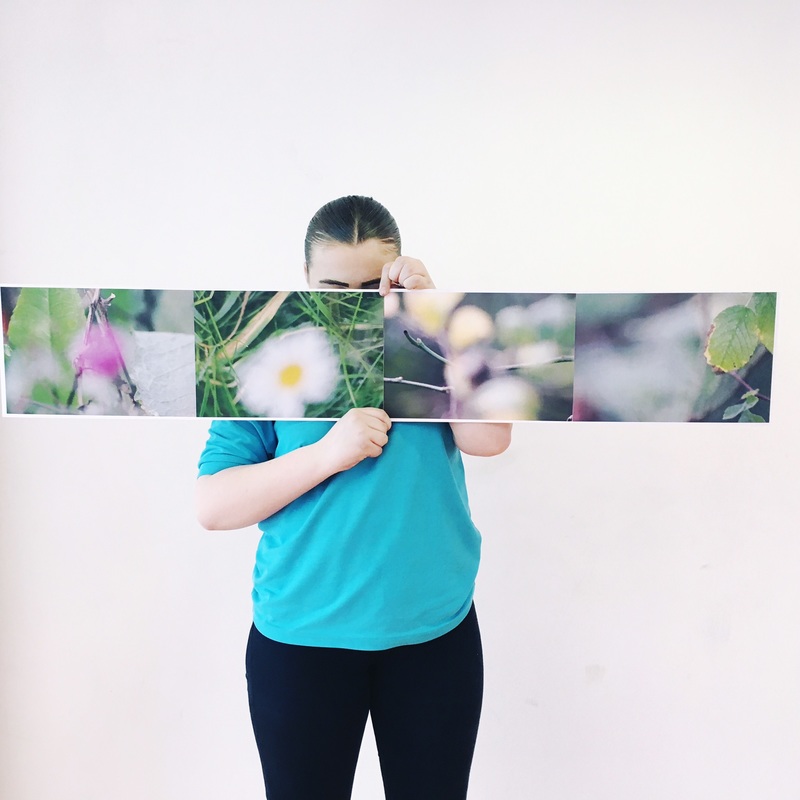
I decided to print and arrange a set of pictures from near the start of this project. I really like the out of focus parts of the pictures. Although they are not of the street, they also remind me of Saul Leiter's photographs.
